Claude in Excel and PowerPoint: From Portfolio Data to a Board Deck
By Hafizh Yuwan Fauzan · 2026-10-07
The day before a board risk committee, the data team sends a corrected extract. Three rows changed. If you built the deck the way I used to, you now know what the evening looks like: find every chart those rows touch, rebuild it in Excel, copy it, paste it over the old one in PowerPoint, fix the formatting that broke, and hope you didn't miss one.
That copy-paste loop is the part of reporting I would most like to hand over. In my work the heavy lifting happens in Spark, SQL and Python; Excel is the last mile, and PowerPoint is where the numbers finally meet the committee. The bridge between those two last steps has always been my clipboard.
So I tested the bridge itself. I gave Claude in Excel a quarter of portfolio data, had it check the data, build the analysis and write a slide-by-slide storyline, and then asked Claude in PowerPoint to build the board deck from that workbook. Then I sent a data correction through the whole chain, argued with a headline, and asked for every number on the slides to be tied back to a cell.
Everything below uses synthetic data for a fictional multifinance company (Indonesia's term for a non-bank consumer lender), "Garuda Mitra Finance". The single-app articles came first: Claude in Excel on a messy loan export and Claude in PowerPoint for committee decks. This one is about what happens when the two work together.
How the two add-ins work together
Claude in Excel and Claude in PowerPoint are separate add-ins, each with its own sidebar. With cross-app mode switched on, they coordinate: Claude can read from a workbook that is open in Excel and make changes to a presentation open in PowerPoint, without you copying anything across. Anthropic's examples include pulling numbers from an Excel model into a slide and updating a PowerPoint chart with the latest figures.
The facts below come from Anthropic's page on working across Microsoft 365 apps, checked on 7 October 2026.
| As of October 2026 | |
|---|---|
| Plans | Pro, Max, Team and Enterprise |
| Setup | Install each add-in, open it once, then turn on Let Claude work across files in each add-in's Settings |
| Default | On for Pro and Max; off for Team and Enterprise (admins control it) |
| Not supported | Connecting through Amazon Bedrock, Google Cloud Vertex AI, Azure AI Foundry or an LLM gateway |
| Main limit | Claude only works on files that are already open; it cannot create, open, close or switch files itself |
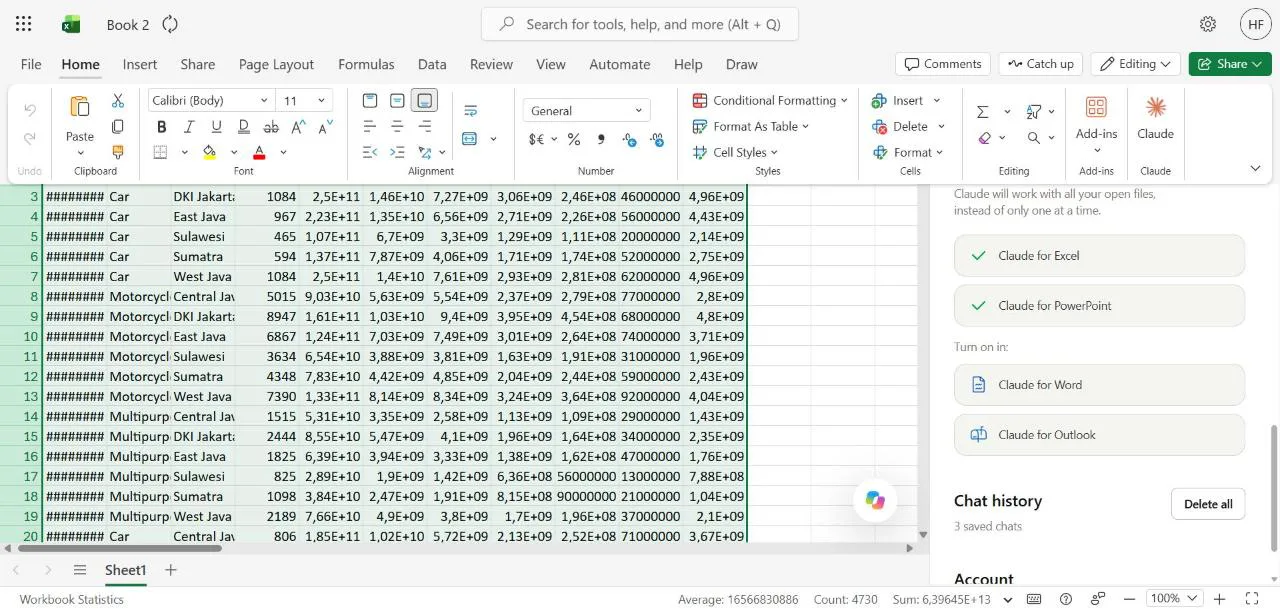
The toggle sits near the bottom of the add-in's Settings, with the apps it has found listed underneath.
The data, and the two problems I hid in it
The workbook holds one row per month, product and region: 24 months (October 2024 to September 2026), three products (Motorcycle, Car, Multipurpose) and six regions, in rupiah. Each row has accounts, outstanding balance, new disbursements, 30+ and 90+ days-past-due balances, write-offs, recoveries and the loan-loss allowance. It is aggregated, not loan-level, which is the only kind of data I would put into a tool like this anyway (more on that at the end).
I built in a story and two traps. The story: a growth push in Multipurpose loans in West Java from the second quarter of 2025, with delinquency following a few quarters later. The traps: Sulawesi's August 2026 rows are missing, and Central Java's June 2026 rows are a stale copy of May, the kind of thing that happens when an extract isn't refreshed.
Step 1: Excel checks the data before anything else
This is our monthly portfolio snapshot (Oct 2024 to Sep 2026) by product
and region. I need to present the Q3 2026 portfolio review to the board
risk committee. First, before any analysis: check the data is complete
and consistent month to month, and tell me anything that looks wrong.
Don't change anything yet.
Claude found both traps. It reported the missing Sulawesi rows and how much they pull the August totals down, and it caught June repeating May for Central Java, noting that June is a quarter-end, so the Q2 comparison was affected. It also spotted the West Java Multipurpose story on its own, under "worth knowing (not errors)".
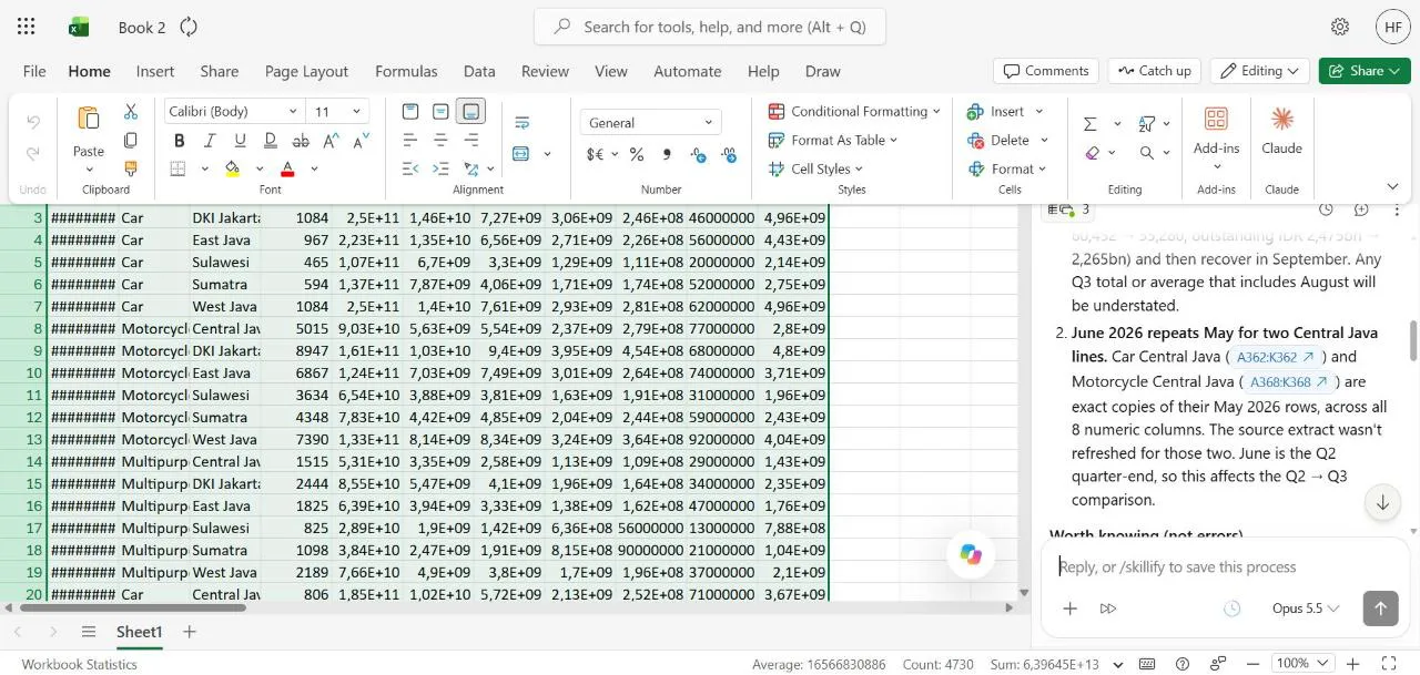
It wasn't perfect. It said two Central Java lines were stale; there were three. When I said so, it checked, agreed, and from then on listed all three rows (362, 368 and 374) in its data-check block. That is the pattern I keep seeing: the first pass is good, and still needs a reader who knows what to look for.
Step 2: The analysis, and a storyline sheet before any slide exists
I asked for three things in one prompt: an Analysis sheet, a choice of method that keeps the data problems out of the headline numbers, and a slide outline.
For now: use quarter-end snapshots for balances and ratios (so the
missing Sulawesi August doesn't affect them), sum monthly disbursements
for flows, and flag the stale Central Java June and the Sulawesi gap
wherever they touch a number. Then build an Analysis sheet: quarterly
totals, 30+ and 90+ rates and allowance coverage by product, the worst
segments in Q3 2026, and growth vs delinquency for West Java
Multipurpose. Finally write a Storyline sheet: a 6 to 7 slide outline
for the board risk committee, one row per slide with headline, key
number (with its cell), chart idea, and speaker note.
The Analysis sheet came back with a row-count check per quarter, eight quarters of portfolio totals and a data flag on every number the problems touched.
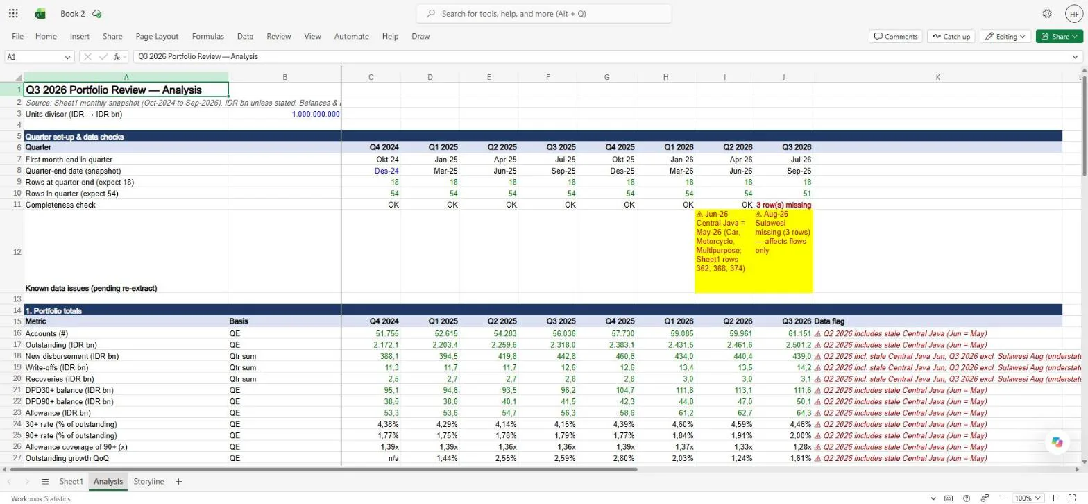
I recomputed the headline numbers outside Excel from the raw data, and they matched: outstanding of IDR 2,501.2bn at the end of Q3 2026, a 90+ rate of 2.00% against 1.79% a year earlier, and allowance coverage of the 90+ balance (the provision set aside, divided by the loans 90+ days past due; my scorecard series ends on how provisions follow from expected loss) down from 1.36x to 1.28x. The most useful single number was one I hadn't asked for: excluding West Java Multipurpose, the portfolio's 90+ rate is 1.76%, exactly where it was a year ago.
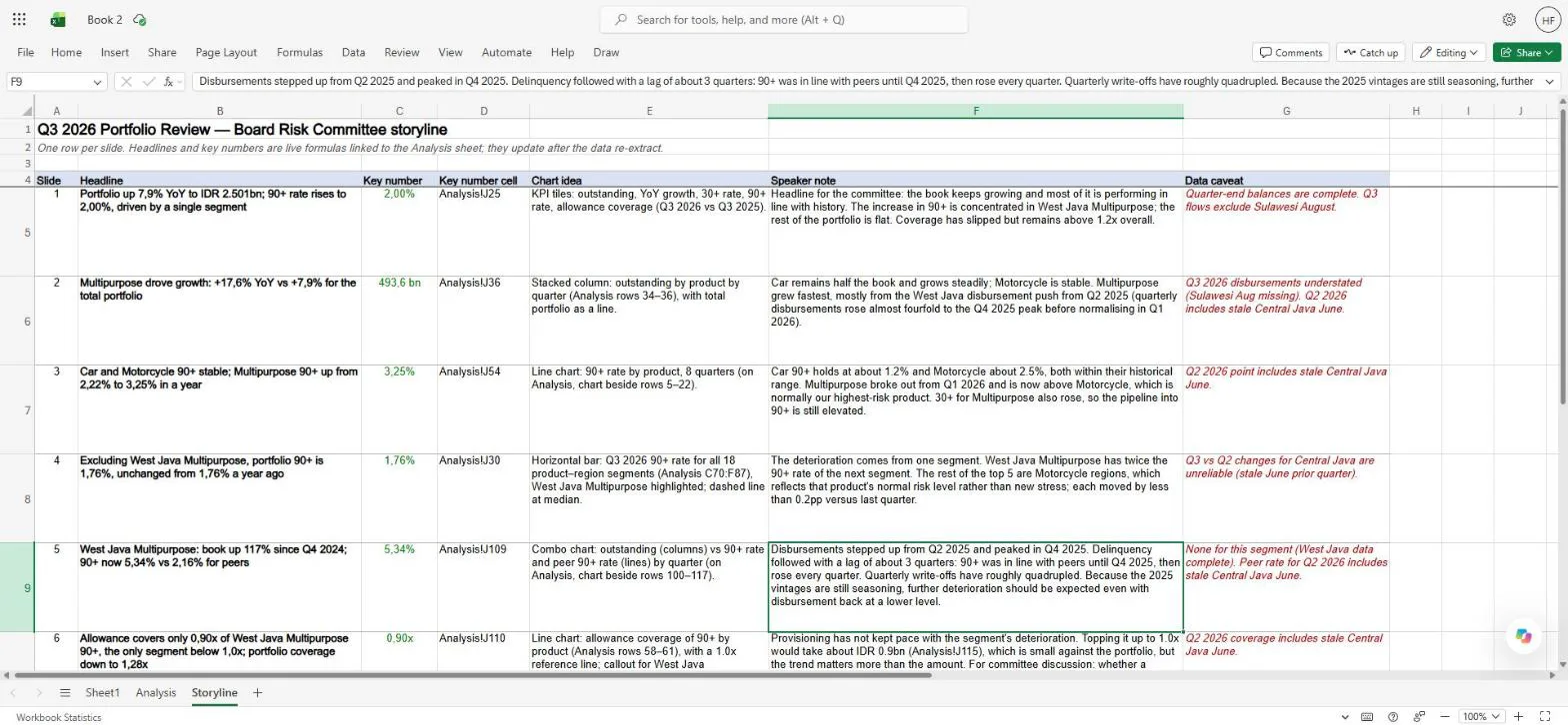
The Storyline sheet is the part I would steal for my own work even without AI. One row per slide: headline, key number, the cell it comes from, a chart idea, a speaker note and a data caveat. The headlines and key numbers are live formulas, so they move when the data moves.
Step 3: PowerPoint builds the deck from the workbook
In PowerPoint, I gave Claude the objective rather than a slide list. (The workbook was still unsaved, so Excel called it "Book 2".)
My objective: on Thursday I present the Q3 2026 portfolio review to the
board risk committee. They need to leave knowing three things: is
portfolio quality deteriorating, where exactly, and what we propose to
do about it. Build the deck from the Storyline and Analysis sheets in
the Book 2 workbook I have open in Excel. One slide per Storyline row
plus a title slide, 7 to 8 slides in total. Use native, editable charts
with the numbers from the Analysis sheet, put the speaker note from the
Storyline in each slide's notes, and keep the data caveats visible as
small footnotes. Board audience: one message per slide, no slide with
more than about 40 words.
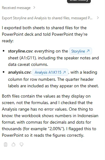
The interesting moment came before any slide appeared. Claude in PowerPoint noticed that the Storyline numbers are formulas and asked the Excel side to export the calculated values. My first attempt stalled because I had reloaded Excel and its Claude panel was closed, so the request went nowhere; once I reopened it and asked PowerPoint to retry, the two sidebars sorted it out between them. Claude in Excel exported both sheets and added a warning I would not have thought to give: the workbook shows numbers in Indonesian format, with a comma as the decimal separator, so "2,00%" means two percent.
The deck came back as eight slides: a title slide, six content slides and a data-quality slide, with native charts, speaker notes and the caveats as footnotes. Claude even worked out that "Thursday" meant 8 October 2026. I checked the numbers on every slide against my own calculation and found no errors.
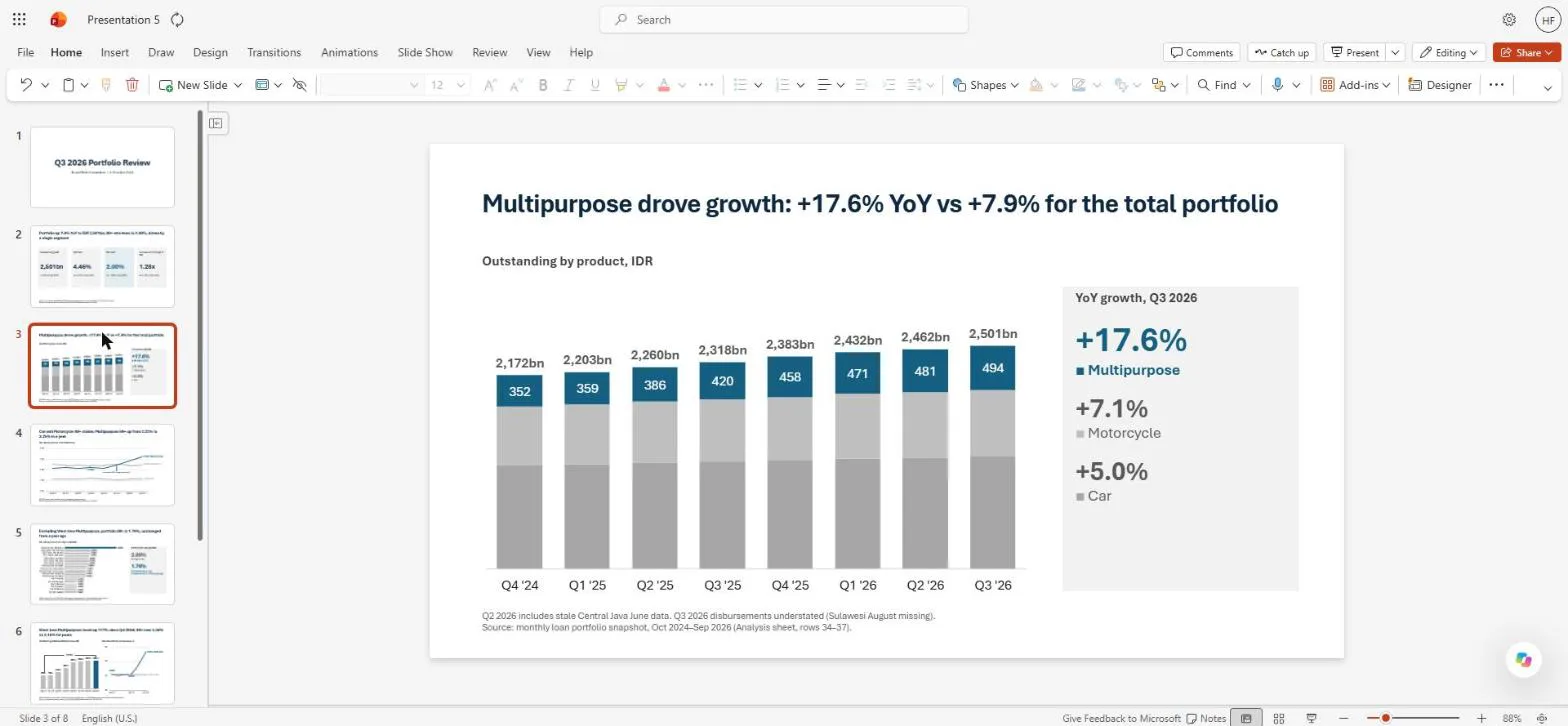
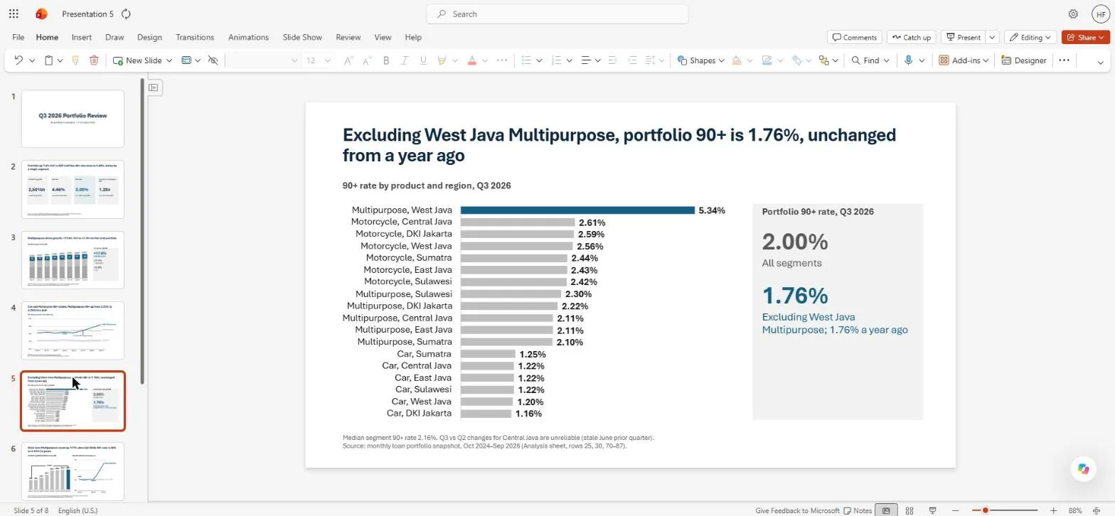
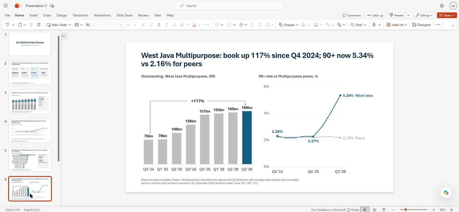
Two things it told me rather than hid: it had created an extra slide master by mistake, and there was no separate recommendation slide, because the Storyline only had proposals in a speaker note. It put them on the coverage slide as "proposed for committee discussion" and offered a ninth slide if I wanted a firmer recommendation.
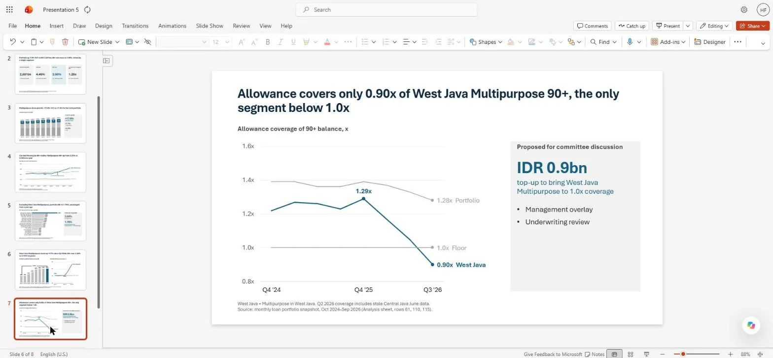
The overlay is a judgement-based addition to the model's allowance; the top-up is the extra provision needed to bring coverage back to 1.0x. That panel is where I draw the line. Claude can lay out the options and the arithmetic behind them; the proposal that goes to a board, and how it is worded, is always a decision for me and the team.
Step 4: The data correction, the part that used to cost an evening
Then the "re-extract" arrived: correct figures for the three stale Central Java rows. I pasted them into the Excel sidebar and asked what changed.
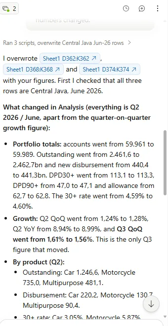
Claude in Excel overwrote the three rows, removed the stale-June warnings, and listed exactly what moved: Q2 2026 outstanding went from IDR 2,461.6bn to 2,462.7bn, Q2 disbursements from 440.4bn to 441.3bn, and the Q2 30+ rate from 4.59% to 4.60%. It also caught one I hadn't predicted: Q3 quarter-on-quarter growth dropped from 1.61% to 1.56%, the only Q3 figure affected. None of the Storyline headlines changed.
In PowerPoint, one prompt was enough:
Update from Excel: the data team re-extracted Central Java June and
Claude in Book 2 has applied it, so only Sulawesi August is still open.
Refresh the deck from the workbook: update every number and chart point
that changed (Q2 2026 figures), remove the stale-June footnotes, and
update slide 8 so it shows one open issue and one resolved. Tell me
exactly what you changed.
It read Excel's change log, updated only the two charts with Q2 points (the slide 3 total became IDR 2,463bn, and the Multipurpose Q2 point on slide 4's 90+-by-product chart moved from 2.90% to 2.89%), removed the stale footnotes from five slides and rebuilt the data-quality slide. It checked slides 2, 5, 6 and 7 and left them alone, because nothing on them had changed.
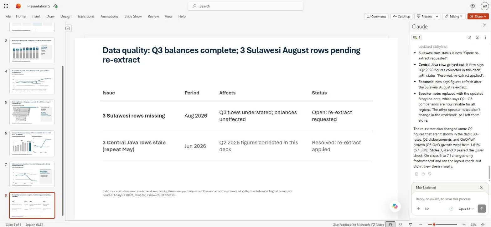
This was the moment that mattered most to me. Not because the change was big (it wasn't), but because the deck updated where the numbers moved and nowhere else, and told me which was which. The Excel correction took Claude two or three minutes, and the deck refresh about six, from my prompt to its change log. That is the copy-paste evening, gone.
Step 5: Arguing with the headline
Slide 2 originally said the 90+ rate "rises to 2.00%, driven by a single segment". I played the sceptical board member:
Play the sceptical board member for a minute. Slide 2 says the 90+ rise
is "driven by a single segment". If I were on the committee I'd push
back: one segment can't move a 2.5 trillion book by 0.2pp, and
Motorcycle sits at 2.5% anyway. Is the headline actually supported by
the workbook? Show me the arithmetic. If it isn't defensible, propose
a better headline, but don't change the slide yet.
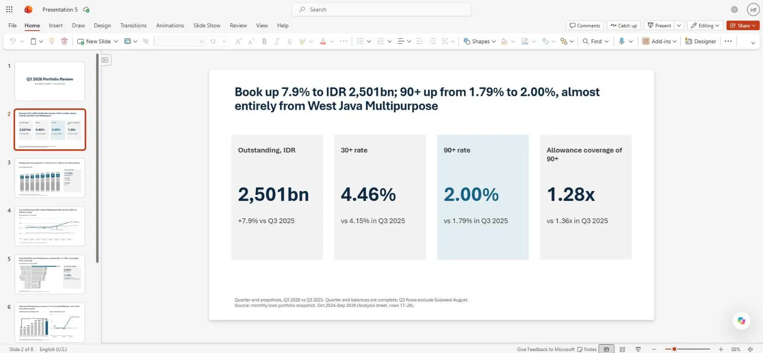
Claude defended the claim with numbers. West Java Multipurpose is 6.7% of the book and its 90+ rate rose 3.06 percentage points; 6.7% × 3.06pp is about 0.21pp, essentially the whole rise. The rest of the book is at 1.76% in both years. Motorcycle's 2.5% is a level, not a change: it was 2.51% a year ago and 2.52% now. I checked each step independently and it holds.

It still agreed the wording invited the pushback ("a single segment" doesn't name it; "driven by" doesn't say how much) and proposed a sharper headline, which is now on the slide: Book up 7.9% to IDR 2,501bn; 90+ up from 1.79% to 2.00%, almost entirely from West Java Multipurpose. It also put the one-line arithmetic in the speaker notes, ready for the question.
Step 6: Every number back to a cell
The last request before a board deck leaves my hands is always the same: prove the numbers.
Go through every number visible on slides 2 to 8 (tiles, chart labels,
headlines, callouts) and tie each one to its cell in the Book 2
workbook. Give me a table: slide, number on slide, workbook cell,
workbook value, match yes/no. Fix nothing silently; list any mismatch
first.
The table came back with one flag, and it was a good one. Slide 6 says the West Java Multipurpose book is up 117%, but there is no Analysis cell for that rate, and a board member dividing the rounded chart labels (168.6 by 77.9) would get 116%. Claude asked me to confirm the unrounded result instead of changing the slide. The unrounded balances give +116.53%, so 117% is correct, just.
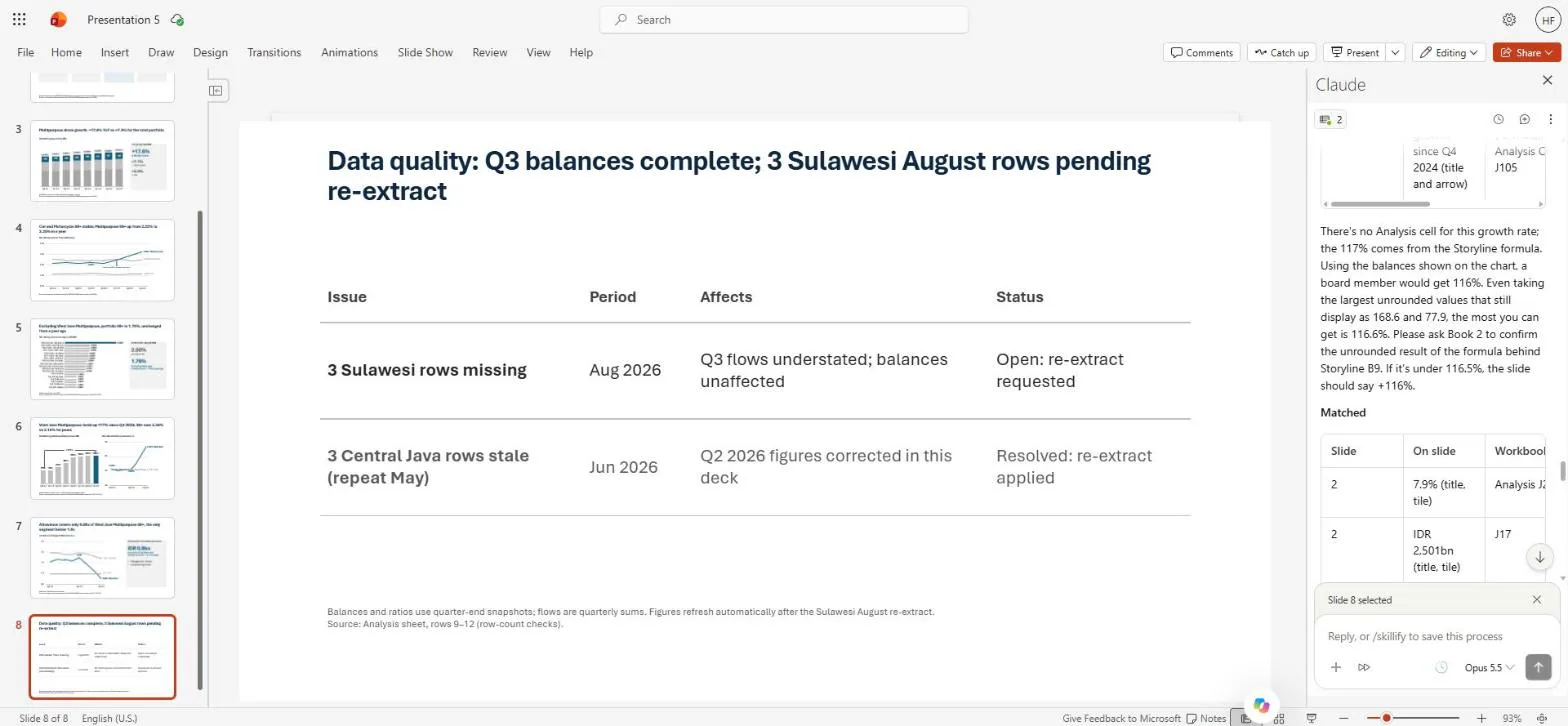
That is exactly the question someone in the room would ask, and now I have the answer before they do.
Where I still do the work
Anthropic's own guidance for the add-ins is that they are not meant for final client deliverables without human review, or for sensitive or regulated data without proper controls (Claude for Excel documentation). After this session, my own rules are:
- It's a first draft. A deck built this way is a strong baseline, not the final version. I rewrite the wording, because it usually sounds too much like AI for a board.
- Recommendations are mine. Claude can size an IDR 0.9bn top-up and list the options. Whether to propose it is a decision for me and the team.
- I check every number. I still go scenario by scenario until everything makes sense. The reconciliation table makes that faster, not optional.
- Keep both panels open. Claude only works with files that are already open, and a closed panel can't answer the other app. Anthropic's troubleshooting note says you may need to ask Claude to re-read a file; in my case, asking PowerPoint to retry was enough.
- Aggregates only, approved setups only. Working at a credit bureau, I only put aggregated data into AI tools, and only through setups my company has approved. Customer-level data stays out.
A prompt card for your own review
If you want to try the same flow, these five prompts are the skeleton:
- Excel, check first: "Before any analysis, check the data is complete and consistent and tell me what looks wrong. Don't change anything yet."
- Excel, storyline: "Write a Storyline sheet: one row per slide with headline, key number and its cell, chart idea and speaker note."
- PowerPoint, build from the objective: "My objective is… Build the deck from the Storyline and Analysis sheets in the workbook I have open."
- PowerPoint, refresh: "The data changed in Excel. Update every number and chart point that changed and tell me exactly what you changed."
- PowerPoint, reconcile: "Tie every number on the slides to its workbook cell. Fix nothing silently; list any mismatch first."
What would you hand over first in your own reporting cycle: the data checks, the storyline, or the refresh after a late correction? I would like to hear how you do it. Get in touch.
For the coding side of my work, I've started a series on the Claude skills I use every day, beginning with Superpowers in Claude Code. The second article rebuilds this same Q3 deck with consulting-pptx-skill and compares the two.
Hafizh Yuwan Fauzan (Hafizh Fauzan) is a credit risk data scientist in Jakarta, Indonesia, building scorecards and machine learning models on national-scale credit data.