After Go-Live: Scorecard Monitoring, PSI, PD and Expected Loss
By Hafizh Yuwan Fauzan · 2026-10-05
Part 7 of 7, the last in a series on building credit risk scorecards. Part 6 set the cutoff and the strategy; this part is everything after the scorecard goes live.
Six months after go-live, the population stability index on new applicants reads 0.145. Is the scorecard broken?
Not necessarily. But it is no longer looking at the same applicants it was built on, and someone has to find out why before the bad rates start to show it. That is what monitoring is for. This part covers the two halves of it, front end (who is applying) and back end (how they perform), when to recalibrate or rebuild, and how a score finally becomes a probability of default and an expected loss.
The numbers continue the simulated portfolio from my refresher on N. Siddiqi's Credit Risk Scorecards (Wiley, 2006). The post-go-live data is a simulated scenario: recent applicants were made younger and more heavily utilised than the development sample, and an illustrative deterioration was applied to the first cohort's bad rates.
Front end: who is applying now?
Front-end monitoring starts the day the scorecard goes live, long before any new account has had time to go bad. It compares the score distribution of recent applicants with the development sample.
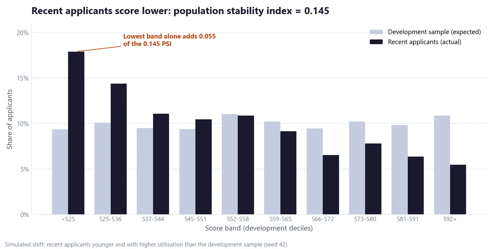
The population stability index (PSI) puts one number on the shift:
PSI = Σ ( actual % − expected % ) × ln( actual % / expected % ) (over score bands)
Siddiqi's rule of thumb (p. 137): below 0.10, no significant change; 0.10 to 0.25, a small change that needs investigating; above 0.25, a significant shift. At 0.145 this scorecard is in the "investigate" zone. The lowest band alone contributes 0.055 of it, because 17.9% of recent applicants now land below 525 points against 9.4% at development. This is the same check as the "ultra out-of-time" test from Part 5, run continuously instead of once.
Which characteristic moved?
PSI says the population shifted, not why. Characteristic analysis does that, one characteristic at a time (Siddiqi, p. 139):
Score impact = Σ ( actual % − expected % ) × points (over the characteristic's attributes)
| Revolving utilisation | Expected | Actual | Points | Score impact |
|---|---|---|---|---|
| <10% | 7.7% | 0.7% | 101 | −7.06 |
| 10–29% | 29.6% | 17.8% | 99 | −11.71 |
| 30–49% | 30.1% | 30.3% | 94 | +0.17 |
| 50–69% | 21.6% | 27.2% | 87 | +4.92 |
| 70–89% | 10.0% | 17.9% | 76 | +5.99 |
| 90%+ | 0.9% | 6.0% | 64 | +3.26 |
| Total | 100% | 100% | −4.42 |
The impacts are calculated on unrounded shares, so recomputing a row from the rounded percentages can differ by 0.01.
Applicants have moved out of the low-utilisation groups, and that alone costs the average applicant 4.4 points. Applying the PSI formula to this single characteristic gives a characteristic stability index (CSI) of 0.38, well above the 0.25 line. Run the same table for every characteristic, including age, which also shifted younger, and the drivers of the PSI become obvious.
Why a bureau is strict about stability
At the bureau where I work, we try to make our models as stable as possible, and we are very strict about it, because we cannot afford to change a scorecard every six months. A bureau score sits inside many lenders' decision systems, cutoffs and strategies at once, and each of them has to re-validate and re-tune when it changes. You can see the same pressure in the US market. As of October 2026, FICO says each lender "determines if and when it will upgrade" to a new score version, and that some "may choose to not change versions"; FICO Score 8 remains "the score most widely used by lenders" (myFICO). The US mortgage agencies relied on Classic FICO for nearly 20 years before their regulator validated newer models in October 2022 (FHFA), and the switch has taken years to roll out.
It also matters how lenders use a bureau score. In my experience, banks rarely use a credit bureau score as their only decision metric. They use it in tandem with their own score, because they hold data a bureau doesn't: what applicants write on the application form and, for existing customers, how their current and savings accounts (CASA) behave. Siddiqi describes this kind of combination: scorecards applied in sequence or as a decision matrix, with in-house versus bureau scores as one example, balancing performance with the bank against performance with other creditors (pp. 144–146). So a bureau score is usually one axis of many lenders' decision matrices at once, which is one more reason it has to stay stable.
Back end: are the bad rates holding?
Front-end reports warn early; back-end reports deliver the verdict. Once the first post-go-live cohort has completed the same 24-month performance window used in development, compare its bad rates with the forecast, band by band, for approved applicants only. Until then, early reads use shorter windows, for example 30 or 60 days past due at 6 to 12 months on book, compared with the same early measure from development.
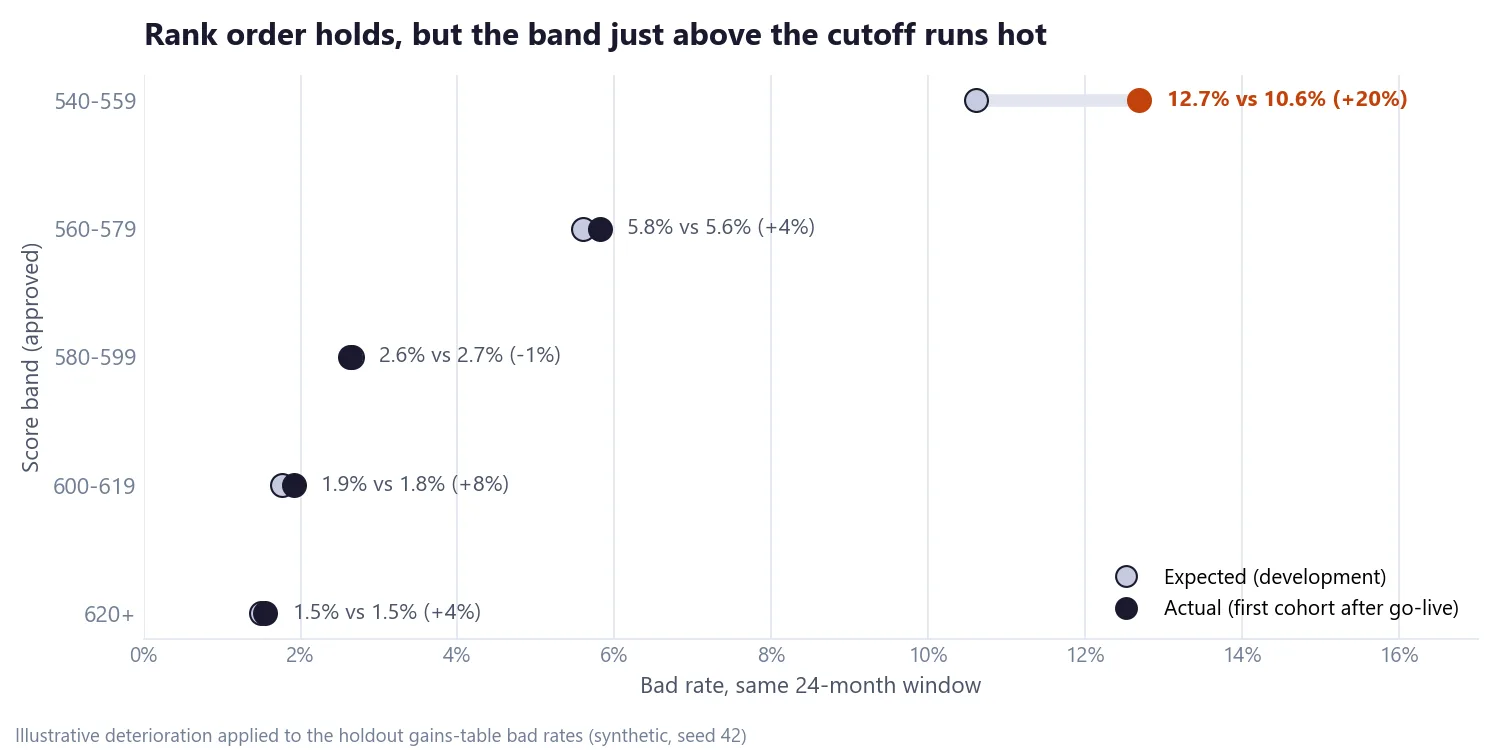
Two things to read. Rank ordering holds: bad rates still fall steadily as scores rise, so the scorecard still ranks risk. The level has moved in one place. Suppose the lender went live with the 540 cutoff from Part 6's opening comparison, approving the whole 540–559 band (Part 6's own strategy would send 540–554 to an underwriter instead). That band, just above the cutoff, runs at 12.7% against 10.6% forecast, about 20% worse, while the bands from 560 up stay within 8% of forecast. Is that real or noise? With a band of this size, around 3,500 approved accounts as in the holdout, a binomial test would flag it (z ≈ 4 against the forecast: about four standard errors away, far beyond chance). If the gap persists in the next cohort, the answer is to revisit the cutoff first, and recalibrate if the gap persists or spreads to neighbouring bands, rather than to rebuild: at 12.7% bad, the band's odds are about 6.9 to 1, further below Part 6's 10 to 1 break-even.
The monitoring calendar
| Report | Question it answers | Type | Typical frequency |
|---|---|---|---|
| Population stability (PSI) | Are applicants' scores distributed as in development? | Front end | Monthly |
| Characteristic analysis and CSI | Which characteristics moved, by how much, and what did it cost in points? | Front end | Monthly |
| Final score and override report | How many were approved, declined or overridden in each band? | Front end | Monthly |
| Delinquency by score band | Do bad rates still rise as scores fall, at the forecast level? | Back end | Quarterly |
| Vintage analysis | Is each new cohort performing better or worse than earlier ones? | Back end | Quarterly |
| Portfolio quality and roll rates | How are delinquency and losses trending across the book? | Back end | Monthly |
Siddiqi recommends running stability reports on applicants from the last three and six months to separate real trends from one-month quirks (p. 163). The vintage and roll-rate analyses are the same tools from Part 2, now pointed at the live portfolio.
When to recalibrate or rebuild
A recalibration adjusts how scores map to odds while keeping the points table. A rebuild starts again from the data. Common triggers:
- PSI above 0.25, or a CSI that stays high for several months
- KS or Gini falling materially from development
- Rank ordering breaking between bands
- A change in product, policy or target market
- A regulatory change. In Indonesia, PSAK 71 (renumbered PSAK 109 from 2024, with no change in substance, per IAI), the local adoption of IFRS 9, brought in a forward-looking expected credit loss model for impairment (IAI); banks were applying it in 2020, when OJK issued guidance on using it during the pandemic (OJK, April 2020), and it meant forward-looking probability-of-default models for provisioning.
For the example in this article, the reports build up over time: at six months, PSI of 0.145 says investigate and the utilisation CSI of 0.38 explains why; once the first cohort's 24-month results arrive, the back end shows rank order holding with one band running hot. The action is to watch the 540–559 band, revisit the cutoff, and recalibrate only if the gap persists or spreads, not to rebuild.
From score to probability of default
A scorecard ranks risk. Turning a score into a probability needs the scaling from Part 5 run in reverse:
odds = exp( ( Score − Offset ) / Factor )
PD   = 1 / ( 1 + odds )
| Score | Good:bad odds | Implied 24-month bad probability |
|---|---|---|
| 520 | 3.13 : 1 | 24.2% |
| 540 | 6.25 : 1 | 13.8% |
| 560 | 12.5 : 1 | 7.4% |
| 580 | 25 : 1 | 3.8% |
| 600 | 50 : 1 | 2.0% |
| 620 | 100 : 1 | 1.0% |
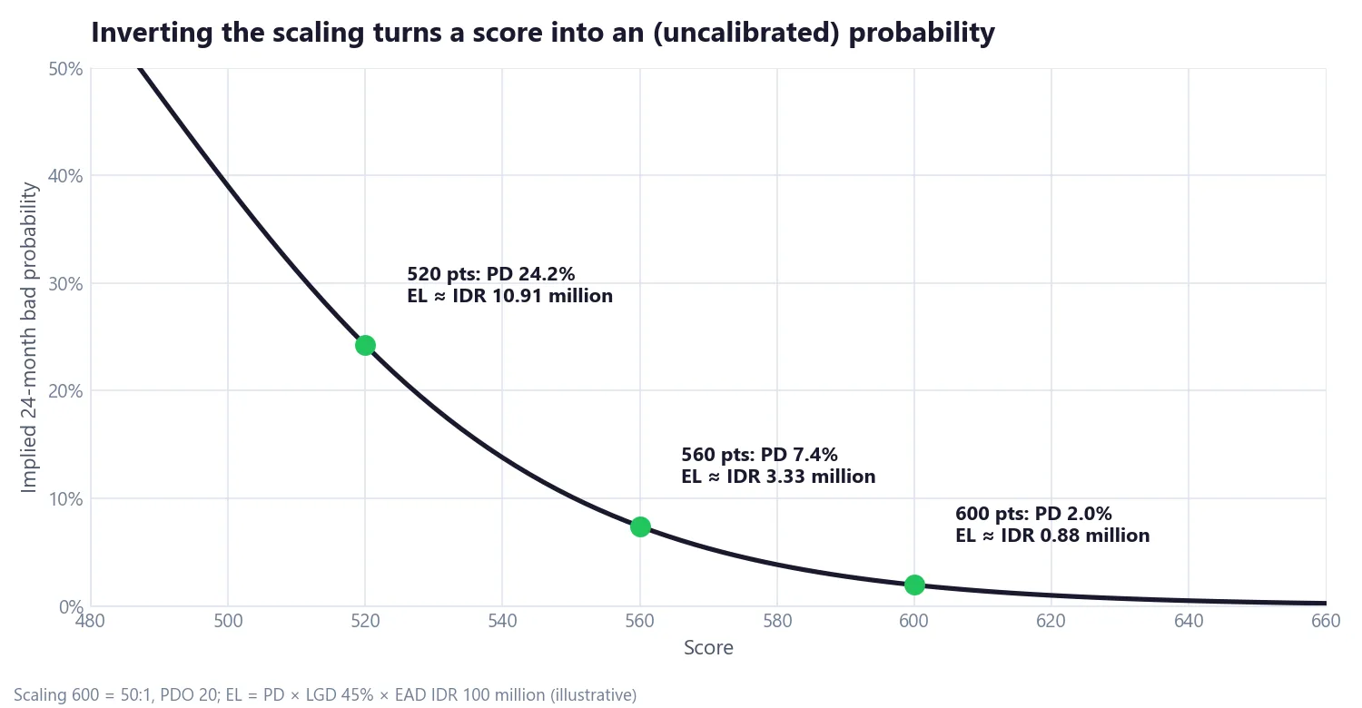
The implied probability is not yet a probability of default that a regulator or an accountant would accept. It is an uncalibrated 24-month "ever 90+ days past due" probability, only as good as the 600 = 50:1 anchor. Two more steps are usually needed:
- For Basel capital, PD estimates must be a long-run average of one-year default rates, so the implied 24-month probabilities are converted to a one-year horizon and rescaled to a through-the-cycle level, meaning an average across good and bad years of the economic cycle (Basel Framework, CRE36).
- For IFRS 9 (PSAK 109, formerly PSAK 71, in Indonesia), provisions need 12-month and lifetime PDs that reflect current and forward-looking conditions, not a fixed 24-month window.
Either way, check the calibration band by band: a binomial test asks whether each band's observed default count is consistent with its predicted PD, and a Hosmer–Lemeshow test does the same across all bands at once.
Expected loss
Probability of default is one of three ingredients:
Expected loss (EL) = PD × LGD × EAD
EAD for revolving credit = drawn balance + CCF × undrawn limit
LGD (loss given default) is the share of the exposure lost after recoveries; EAD (exposure at default) is how much is owed when default happens; for credit lines, a credit conversion factor (CCF) estimates how much of the unused limit gets drawn first. With the illustrative LGD of 45% and exposure of IDR 100,000,000 used in Part 6:
| Score | PD (unrounded) | LGD | EAD | Expected loss |
|---|---|---|---|---|
| 600 | 1.96% | 45% | IDR 100,000,000 | IDR 882,000 |
| 560 | 7.41% | 45% | IDR 100,000,000 | IDR 3,333,000 |
| 520 | 24.24% | 45% | IDR 100,000,000 | IDR 10,909,000 |
Expected loss feeds pricing, provisions and the break-even cutoff from Part 6. As with PD, production figures use a calibrated 12-month or lifetime PD, not the uncalibrated 24-month figure shown here.
The whole series, in seven lines
- How a credit scorecard works: points add up to odds, and every 20 points doubles them.
- Defining "bad": windows, vintages and roll rates decide what the model learns.
- WOE, IV and logistic regression: group by hand, rank by information value, combine in a regression.
- Reject inference: approved-only data makes the low bands look far safer than they are.
- Scaling, KS, Gini and validation: turn the model into points and prove it holds out of time.
- Cutoffs and strategy: every cutoff trades approvals for bad rate; agree the goal first.
- After go-live (this article): watch stability from day one, check performance band by band, and calibrate before calling a score a PD.
Thank you for reading the series. If you build or validate scorecards and want to compare notes, especially on monitoring and stability, get in touch.
Hafizh Yuwan Fauzan (Hafizh Fauzan) is a credit risk data scientist in Jakarta, Indonesia, building scorecards and machine learning models on national-scale credit data.