Claude in Excel: From a Messy Loan Export to a Risk Dashboard
By Hafizh Yuwan Fauzan · 2026-10-06
The export said 3,014 loans. There were 3,000.
Fourteen rows had been exported twice, sixty application dates had arrived as plain numbers like 20250109, and Jakarta was spelled four different ways, one of them with a trailing space. None of that shows when you scroll through a sheet. All of it shows up later, when your total doesn't match the finance report.
In my work, the heavy lifting happens in Spark, SQL and Python. Excel is the last mile, where results meet the people who make decisions. When I started out, a clean-up and dashboard like this one took me a few days. These days it takes about half a day, and most of that is not the cleaning. It is building the dashboard: writing the formulas and formatting everything so a meeting can read it at a glance. Across the field, the cleaning alone is a big share of the job: in Anaconda's 2021 State of Data Science survey, respondents said they spent about 39% of their time on data preparation and cleansing, more than on model training, selection and deployment combined.
This article follows one working session with Claude in Excel, from that raw export to a dashboard a risk meeting could use, including a round of feedback, a false alarm and one error that produced no error message at all. The lender, "Nusa Kredit Finance", is fictional and every number is synthetic. If you want the earlier piece on slides, it is how I use Claude in PowerPoint.
What Claude in Excel is
Claude in Excel is an add-in that opens Claude in a sidebar next to your workbook. You ask in plain language; it reads the sheets, writes formulas, formats, builds charts and explains what it did, with citations that link to the cells it used. (Anthropic's documentation calls it Claude for Excel; it installs as part of the Claude for Microsoft 365 add-in.)
Two things set it apart from pasting a table into a chatbot:
- It works in the workbook itself. Changes land as real formulas, formats and charts you can inspect and edit, not as a block of text to copy back.
- It asks before it changes things, unless you tell it not to. Edits come up for approval by default, and Claude warns you before overwriting existing data.
All product details below come from Anthropic's documentation for Claude for Excel, checked on 6 October 2026.
| As of October 2026 | |
|---|---|
| Plans | Pro, Max, Team and Enterprise |
| Runs on | Excel on the web; Excel on Windows with a Microsoft 365 subscription; Excel on Mac |
| Doesn't run on | Excel 2016 and 2019 perpetual or volume licences; Excel on iPad or Android |
| Not supported | Data tables; macros and VBA |
Setup is the same as for PowerPoint: install Claude for Microsoft 365 from Microsoft AppSource, open Excel, find Claude on the Home tab (on Windows it is also under Home → Add-ins) and sign in with your Claude account. At a company, check with IT first; admins can deploy it for everyone.
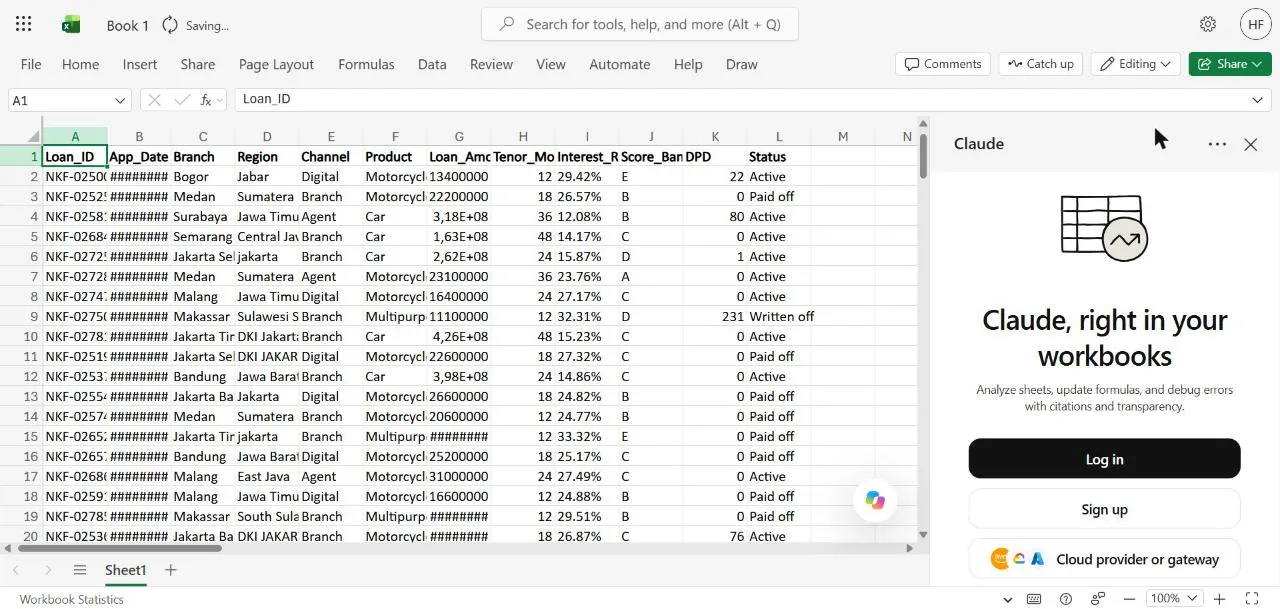
Step 1: Ask what's wrong before you touch anything
I pasted the export into a blank workbook exactly as it came and started with a question, not an instruction:
This is the September loan export from our core system, pasted as is.
Before I build anything on it: what's in this sheet, and what looks
wrong with the data? Don't change anything yet.
Claude read all 3,014 rows and came back with a profile (branches, channels, products, status counts) and a numbered list of problems: 14 duplicated rows, 60 dates stored as numbers, 15 spellings for 6 regions, interest rates stored as text, 28 blank days-past-due values and 40 amounts formatted in dollars instead of rupiah, most of them with example row numbers.
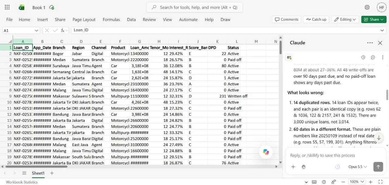
Two findings were not on my list of planted problems. It noticed the application dates stop in June 2026, which doesn't fit a "September" export, and asked whether the extract had been cut off. And it flagged 69 active loans that are more than 90 days past due but not written off, which "may be your policy, but it affects any NPL figure" (the non-performing loan ratio). Both are exactly the questions a careful analyst asks before building anything.
The answer to the first was simple: applications run to June, and status is measured as at 30 September. Saying that out loud in the next prompt is what makes the rest of the session go right.
Step 2: Clean it on a copy
Good catches. The dates are fine: applications run to June, and DPD and
status are as at 30 Sep 2026. Please clean it on a new sheet called Clean
and leave Sheet1 untouched (rename it Raw_Export). Remove the duplicates,
convert the dates and rates, use the English region names, format amounts
as IDR. Keep blank DPD blank and add a flag column for them, don't turn
them into 0. Then tell me how many rows you ended with.
The last two sentences matter most. A blank days-past-due value is not the same as zero, and silently filling it would make the portfolio look healthier than it is.
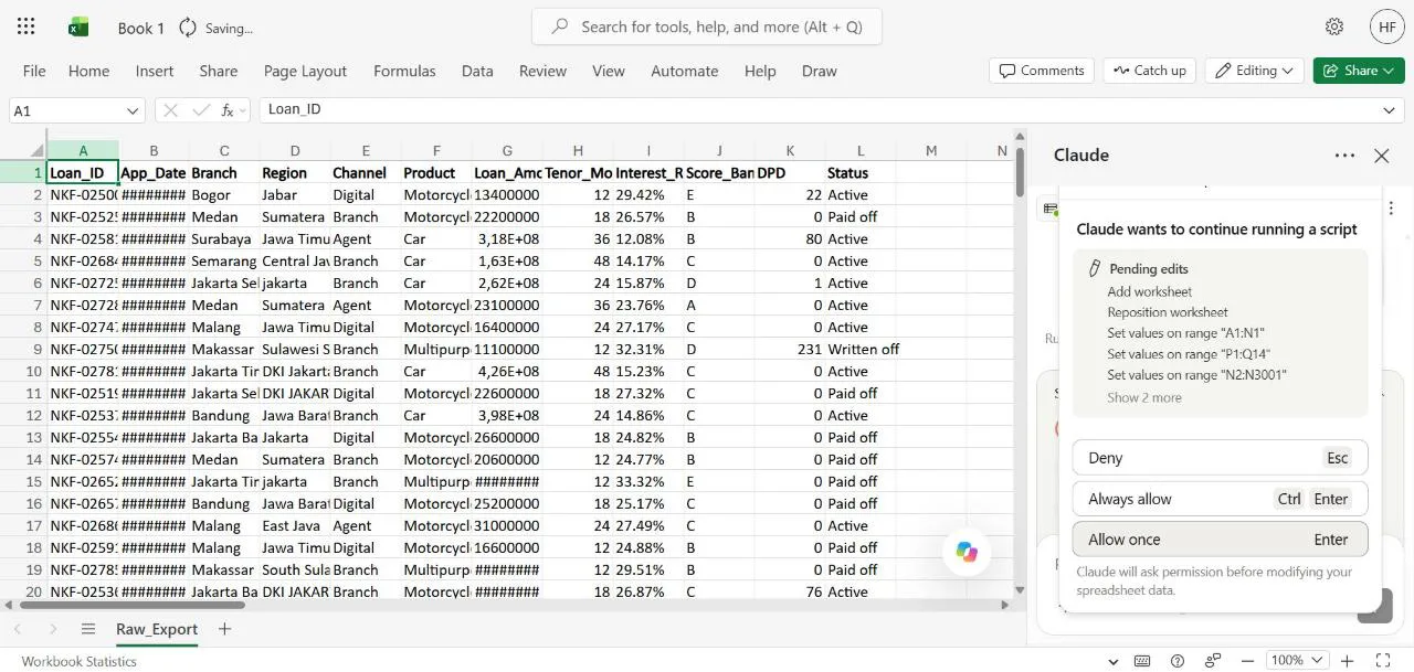
Before each batch of changes, the sidebar showed a Permission required card listing the pending edits: add a worksheet, set values on these ranges, rename that sheet. You can deny, allow once, or always allow. I allowed the first two one at a time to see what it does, then switched to always allow for this throwaway workbook.
The Clean sheet came back with proper dates, English region names mapped through a small lookup table, amounts in rupiah and a DPD_Blank_Flag column. Claude re-read its own output and reported 3,000 unique loan IDs, 28 blanks matching 28 flags, and no formula errors. Any region spelling it hasn't seen before will show as "UNMAPPED" rather than slip through.
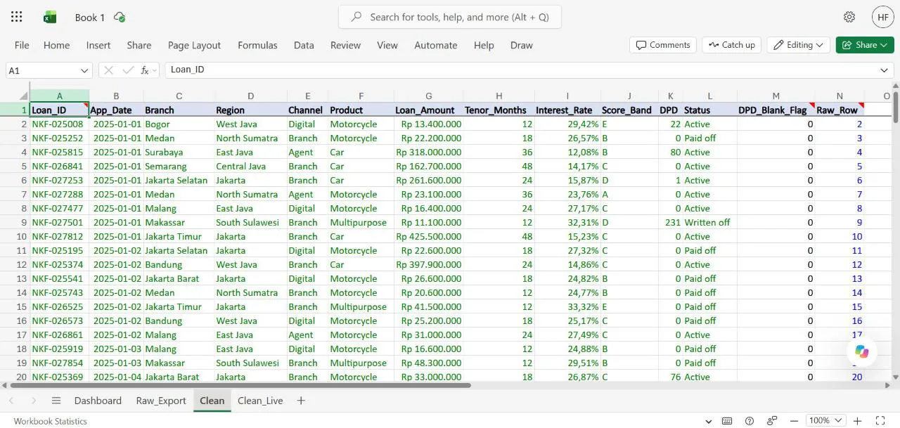
Notice the last column, Raw_Row. It matters in a minute.
Step 3: The dashboard, and the warning I'm glad I read
Now build a Dashboard sheet for our monthly risk meeting, on one screen.
Top row: KPI tiles for number of loans, total disbursed, 30+ DPD rate and
90+ DPD rate (by count, active and written-off loans only). Below: monthly
disbursement trend as a chart, 90+ rate by channel and by product, and a
score band table so we can see if A to E still rank properly. Use formulas
pointing at Clean so it updates when I paste next month's export.
Claude didn't start building. It laid out a plan and asked two questions first: whether "30+" means 30 or more days or more than 30, and whether loans with a blank days-past-due value should be left out of the rates. These are definition questions, and they are the ones that cause arguments in risk meetings later, the same trap I wrote about in defining "bad".
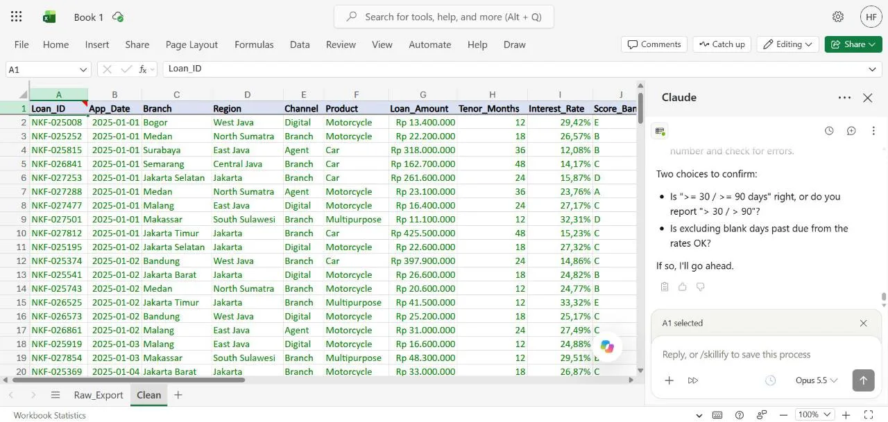
I answered (30 or more, 90 or more, and exclude the blanks as long as the count is shown). A minute later a red Potential data loss card appeared: Claude wanted to clear A2:N3001, the whole Clean sheet.
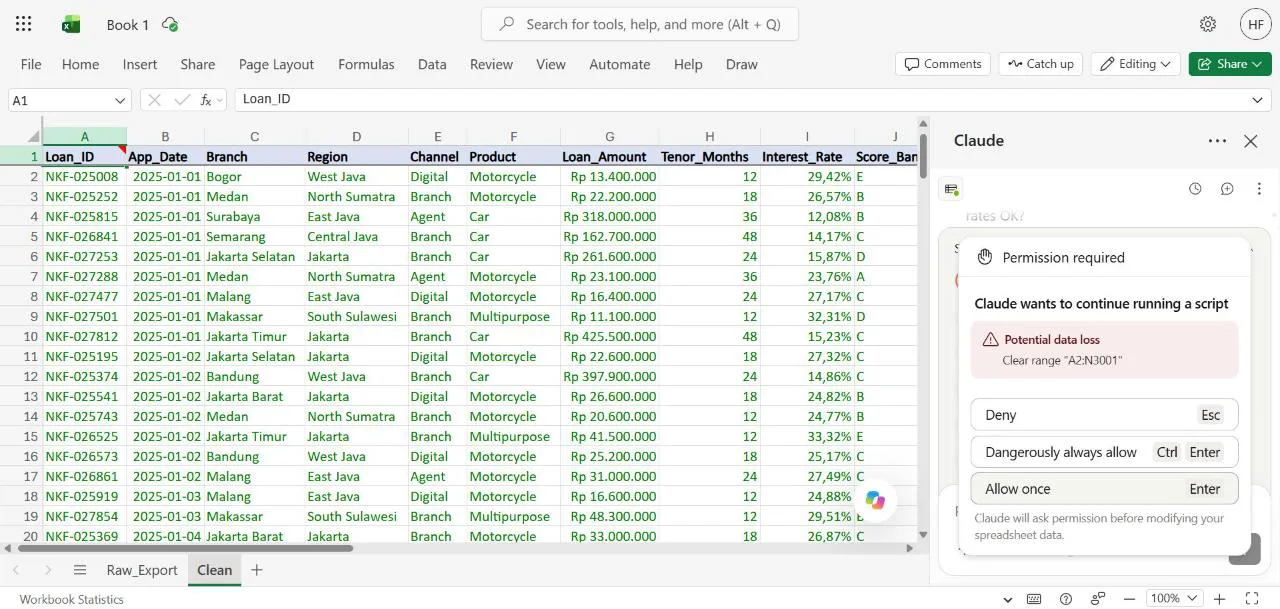
I denied it and asked why. The answer was candid. The Clean sheet from Step 2 looked up each row by a fixed row number from this month's export (that Raw_Row column). Next month's paste would have different duplicates in different places, so Clean would have quietly read the wrong rows, and a dashboard on top of it would "update, but from the wrong set of rows". Making it truly self-updating meant rebuilding the sheet with formulas that work out the unique rows themselves, and that required clearing it.
It then offered three options and recommended one: keep Clean as this month's snapshot and build a separate self-updating sheet, Clean_Live, for the dashboard.
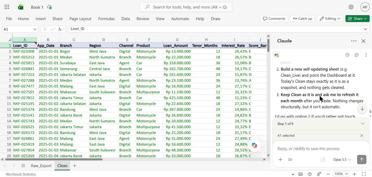
This is the most useful exchange in the whole session. Nothing was broken yet. The design flaw would only have shown up in month two; I caught it in month one because a warning made me stop and ask.
The finished dashboard has four KPI tiles, a monthly disbursement chart, the three tables and, off to the side, an inputs block (as-at date and thresholds), the rate workings and a data checks block: 3,014 rows in, 14 duplicates removed, 28 blank values, 22 of them excluded from the rates (the other 6 are paid-off loans, which aren't in the denominator anyway), 0 unmapped regions.
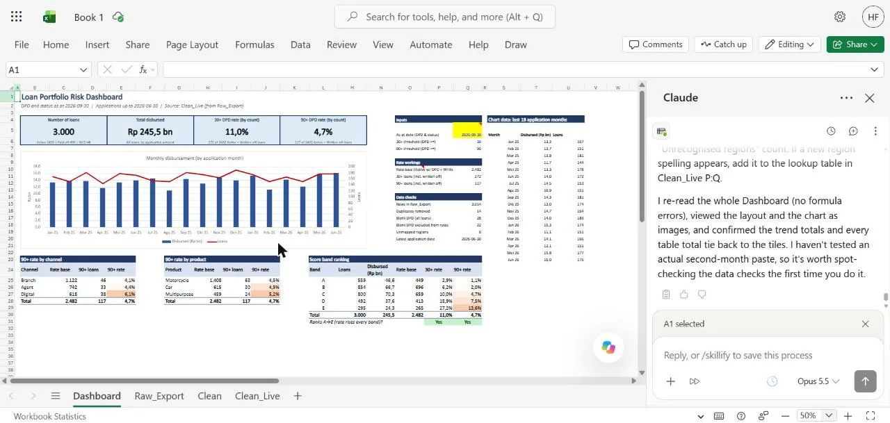
I recomputed every headline figure from the source data outside Excel: 3,000 loans, Rp 245.5 bn disbursed, a 30+ rate of 272 out of 2,482 (11.0%) and a 90+ rate of 117 out of 2,482 (4.7%). All matched, and so did every row of the three tables. The score bands rank cleanly from 1.1% in band A to 13.6% in band E, which is what you want to see from a scorecard that still ranks risk properly, and a Yes/No cell under the table checks that ranking every month. (If those bands are new to you, my series on how credit scorecards work starts from the beginning.)
Step 4: A round of manager feedback
Dashboards rarely survive first contact with a manager. I wrote the feedback I would expect from a head of risk and gave it to Claude as if it were real:
Feedback from my head of risk on the first version: 1) each regional
manager wants to see their own numbers, so add a Region dropdown at the
top (with "All regions" as default) that filters every tile, table and
the chart. 2) Our appetite limit for 90+ is 5%, so any 90+ rate above 5%
should turn red, and say what the limit is somewhere on the sheet. Don't
touch Clean or Raw_Export.
Claude read the existing formulas before changing them, asked permission for the edits, and recovered on its own when one write failed halfway ("Only B5 got written, and it's correct. Redoing the rest safely."). The dropdown builds its region list from the data, so a new region would appear automatically. The 5% limit became an input cell, the 90+ tile title now says "limit 5%", and a red footnote explains the rule.
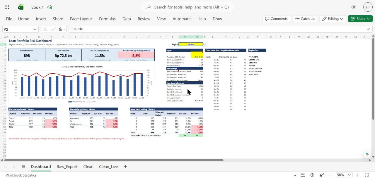
Switching the dropdown to Jakarta showed what a regional manager would see: 898 loans, Rp 72.5 bn, and a 90+ rate of 5.8%, red because it is over the limit. I checked those against the source data too: 43 loans out of 738, exactly.
Step 5: When a number is wrong but nothing looks broken
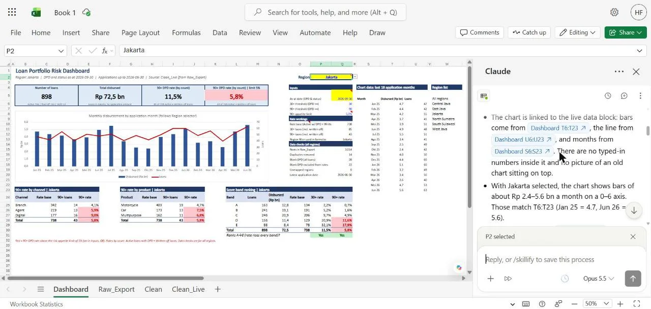
Next, I reported a problem: the chart bars still looked like the full portfolio after I picked Jakarta. Claude checked where the chart reads its data, confirmed the ranges were live and the bars matched Jakarta's numbers, and suggested Excel simply hadn't redrawn yet. It was right. A reload showed Jakarta's bars, and it hadn't "fixed" anything that wasn't broken.
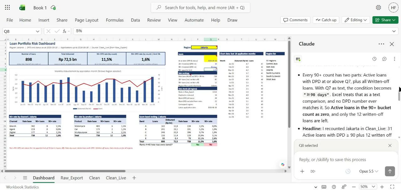
Then I set a real trap. I typed 90 days instead of 90 into the 90+ threshold cell, the kind of slip anyone makes on a Friday afternoon. Excel showed no error. Jakarta's 90+ rate quietly fell from 5.8% to 1.6%, the red flags disappeared, and the score band check flipped to "No". A dashboard in that state looks healthier than the month before, which is the worst kind of wrong.
Strange one: with Jakarta selected the 90+ rate was 5.8% this morning,
now it shows 1.6%, the red flags are gone and the A-to-E ranking check
says No. Nobody pasted new data. Can you trace what changed and why?
Don't fix anything until you've told me the cause.
Claude found it. Every 90+ count is written-off loans plus active loans whose days past due are at or above the threshold cell. With the threshold stored as text, the condition becomes a text comparison that no number ever matches, so the 31 active loans dropped out and only the 12 written-off ones were left: 12 out of 738 is 1.6%. It also explained the "No": the missing loans sat mostly in bands D and E. And it said plainly what it could not see: the workbook doesn't keep an edit history it can read, so it pointed me to Version History to find out who changed the cell.
This was the part that surprised me most. A wrong number with no error attached is the hardest kind to find, and Claude went from symptom to cause without being told where to look.
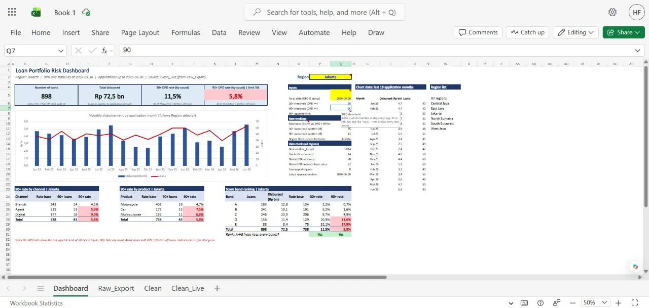
I asked it to put 90 back and make the threshold cells accept whole numbers only, with a short input message for the next person.
Prompts you can copy
Start every new file with a read-only question:
Before I build anything on this sheet: what's in it, and what looks wrong
with the data? Give row numbers. Don't change anything yet.
Protect the raw data and say what blanks mean:
Clean this on a new sheet and leave the original untouched. Keep blank
values blank and add a flag column for them; don't turn them into 0.
Tell me how many rows you ended with and why.
Make definitions explicit before building:
Before you build, list every definition you're assuming (thresholds,
which loans are in the denominator, date basis) and ask me to confirm.
When a number moves and you don't know why:
This number changed from X to Y and nobody pasted new data. Trace what
changed and why. Don't fix anything until you've told me the cause.
Before anything leaves the workbook, test it, then reconcile it:
Test this dashboard for edge cases: switch through every region, include
blank values and segments with no loans, and show me anything that breaks.
Then confirm every table total ties back to the tiles and to the raw row
count, and list any that don't.
Where it still needs a human
Anthropic's documentation says Claude in Excel is not recommended for final client deliverables without human review, for audit-critical calculations without verification, or for models with highly sensitive or regulated data without proper controls. After this session I would add:
- Check every number before it leaves. I don't send numbers anywhere until I have checked them all and they make sense to me, scenario by scenario. I use Claude for that too: I ask it to test the edge cases first, then reconcile every total (the last prompt above). For this article I also recomputed every headline figure outside Excel. Claude's own checks were right every time, but a risk number going to a committee needs a second source.
- Read the warnings. The data-loss card in Step 3 was the most valuable moment of the session, and the easiest one to click through.
- Say what you mean by every definition. "90+", "active", "as at" and what a blank means are business decisions. Claude asked about two of them; it can't know your policy on the rest.
- Only use trusted files. Anthropic warns that files from outside sources, such as downloaded templates or vendor files, can contain hidden instructions aimed at the add-in. Start from a trusted copy.
- Keep customer-level data out. Everything here is synthetic. Working at a credit bureau, my own rule is simple: only aggregated data goes into AI tools, and only through setups my company has approved. In Indonesia, access to credit information is regulated (for SLIK, POJK 18/2017 as amended by POJK 11/2024); check with your risk and compliance team before loading anything real.
On data handling, the documentation says chat history is stored locally in your browser, inputs and outputs are deleted from Anthropic's backend within 30 days (with exceptions set out in its retention policy), and the add-in does not inherit custom retention settings your organisation may have set.
Your turn
Claude in Excel did the part of this job that was never analysis: the cleaning, the formulas, the formatting and the hunt for a text value hiding in a number cell. For me, the dashboard itself (formulas and formatting) is where it saves the most time. What it could not do was decide what a blank means, what the appetite limit is, or whether a 4.7% rate is good news. That part is still yours. When the numbers need to become slides, the next step is Claude in Excel and PowerPoint working together.
What is the messiest export you deal with every month, and which of its problems would you want an assistant to catch first? I would like to hear about it: get in touch.
Hafizh Yuwan Fauzan (Hafizh Fauzan) is a credit risk data scientist in Jakarta, Indonesia, building scorecards and machine learning models on national-scale credit data.