Weight of Evidence, Information Value and Logistic Regression for Credit Scorecards
By Hafizh Yuwan Fauzan · 2026-10-01
Part 3 of 7 in a series on building credit risk scorecards. Part 1 showed how points turn into odds; Part 2 settled what "bad" means and who belongs in the sample.
Take the applicants aged 55 and over in our development sample. They make up 13.86% of all good accounts but only 4.83% of the bad ones, so they are 2.87 times more common among goods than among bads. Take the natural log of that ratio and you get 1.053, this age group's weight of evidence. A few steps later, that number becomes the 124 points a 55-year-old applicant receives on the finished scorecard, which Part 5 builds in full.
This part is about those few steps: how raw characteristics such as age are cleaned, grouped, measured and combined into a model. It is also the part of a scorecard build that takes the longest, and I will explain why I still do most of it by hand.
All numbers here come from the same simulated portfolio of 40,000 applicants I built for my refresher on N. Siddiqi's Credit Risk Scorecards (Wiley, 2006), the book this series follows. The model is fitted on a 70% development sample of 28,000 accounts (25,187 goods and 2,813 bads), and the Gini figures come from the 30% holdout. The fine and coarse classing chart uses a smaller 2,810-account subsample, so its weights differ from the table (55+ is +1.22 there against +1.053), and the smaller sample makes the noise in narrow bands easier to see.
Clean before you group
Before any grouping, the data has to be explored, because every problem left in it ends up baked into the scorecard.
| Issue | Treatment options | What scorecard practice does |
|---|---|---|
| Missing values | Exclude, impute, or keep as a separate group | Keep "Missing" as its own group and let its weight speak. Here, missing time at address has a weight of −0.27: riskier than average, which is information worth keeping |
| Outliers | Cap, trim, or verify against source systems | Once confirmed as genuine, grouping neutralises extreme values on its own |
| Correlation | Correlation matrix, variable clustering | Keep the strongest, most explainable member of each correlated group |
| Data quirks | Check with operations for system changes | Look for sudden shifts in distributions over the sample window |
The missing-value row is worth dwelling on. Imputing a missing time at address with the average would hide the fact that applicants who leave it blank behave differently. In a scorecard, "didn't answer" is often a characteristic in its own right.
Weight of evidence: one scale for every characteristic
Weight of evidence (WOE) measures how strongly each group of a characteristic separates goods from bads:
WOE = ln( % of goods in the group / % of bads in the group )
Here it is for age:
| Age | Goods | Bads | % of goods | % of bads | WOE |
|---|---|---|---|---|---|
| 18–24 | 1,585 | 382 | 6.3% | 13.6% | −0.769 |
| 25–29 | 3,522 | 645 | 14.0% | 22.9% | −0.495 |
| 30–34 | 4,377 | 621 | 17.4% | 22.1% | −0.239 |
| 35–44 | 7,738 | 764 | 30.7% | 27.2% | +0.123 |
| 45–54 | 4,473 | 265 | 17.8% | 9.4% | +0.634 |
| 55+ | 3,492 | 136 | 13.9% | 4.8% | +1.053 |
Reading it takes three rules:
- Above 0: the group holds proportionally more goods than bads, so it is lower risk than average.
- Below 0: proportionally more bads, so higher risk.
- Exactly 0: the group behaves like the average applicant.
A group with zero goods or zero bads has no finite WOE, so it has to be merged with a neighbour. The real value of WOE is that it puts every characteristic, numeric or categorical, on one comparable scale. Age, residential status and number of credit inquiries can then all enter the same model in the same units.
Fine classing, coarse classing, and why age is rarely a straight line
Grouping happens in two passes. Fine classing cuts a characteristic into many narrow bands to see its raw shape. Coarse classing merges those bands until the pattern is stable and explainable.
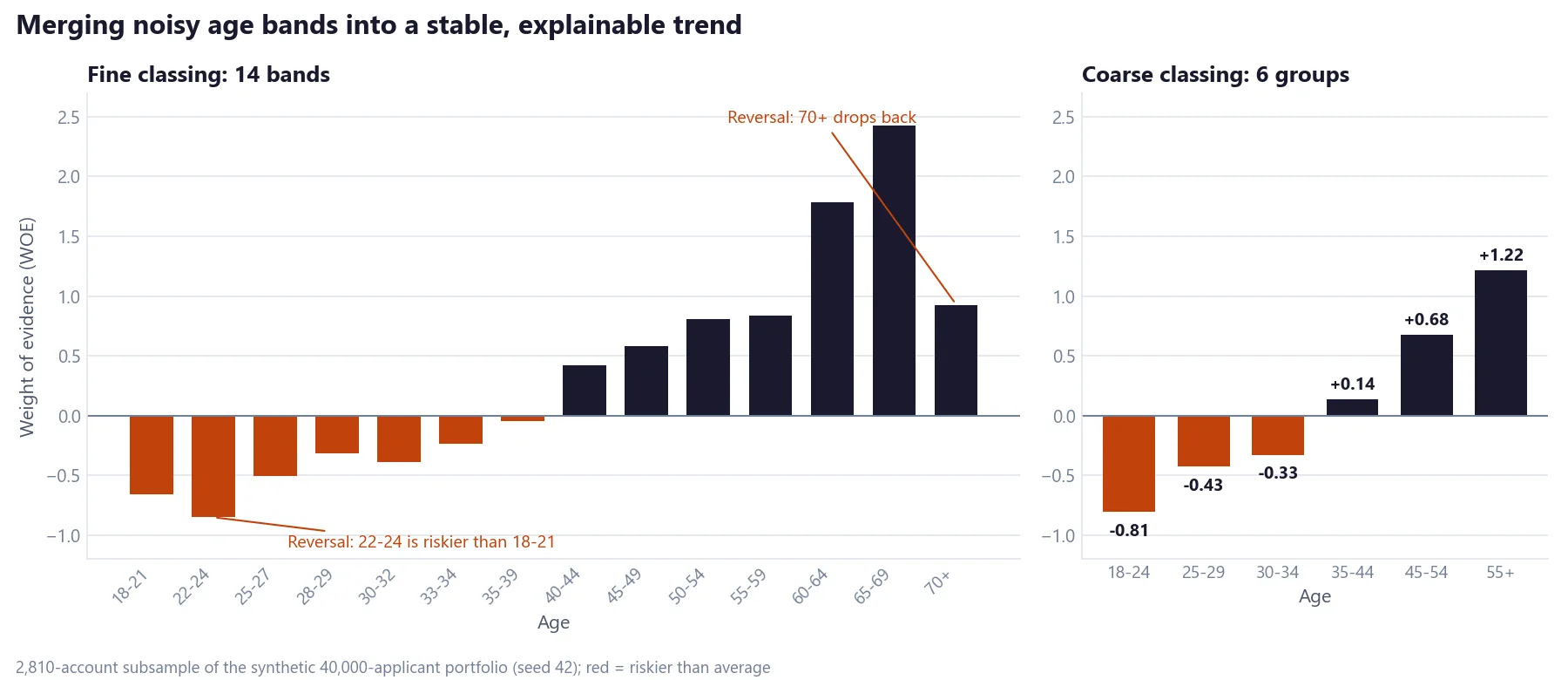
The fine classing shows exactly why this step exists. The 22–24 band is riskier than 18–21, and the 70+ band drops back well below 65–69. Both come from small bands, so neither is a trend I would put in a scorecard without checking it first. Merging into six groups gives a steady rise from −0.81 to +1.22 that anyone in credit can explain.
In my experience, age is very often not monotonic in raw data, and that is precisely why we use WOE binning rather than putting age into a model as a straight number. A logistic regression on raw age can only draw one straight line through the relationship; grouped WOE lets each age band carry its own weight. Siddiqi makes the same point: one advantage of grouping is that "nonlinear dependencies can be modeled with linear models", and the goal is a "logical (not necessarily linear)" relationship. He adds that some reversals reflect real behaviour, and "where valid nonlinear relationships occur, they should be used if an explanation using experience or industry trends can be made" (pp. 78 and 83–84).
Research on financial decision-making points the same way. Across ten types of credit transactions, Agarwal, Driscoll, Gabaix and Laibson found that financial mistakes, such as paying higher interest rates and fees, follow a U-shape over the life cycle: they are lowest around age 53 and higher for both younger and older borrowers (The Age of Reason, Brookings Papers on Economic Activity, Fall 2009). The study measures costly mistakes, not defaults, and its turning point need not match any given portfolio. But it is a plausible reason why an older age band can turn back down for real.
So a 70+ band that dips is not automatically noise. In the 2,810-account subsample it holds only 86 accounts, about 3%, below the 5% minimum discussed below, so it merges into 55+. With enough volume, I would test whether the dip holds before merging it away.
Why I still bin by hand
Automated binning tools will happily produce groups that maximise a statistic. What they cannot do is decide whether a reversal is a data quirk or real behaviour, or whether a group boundary will make sense to the credit committee. So I review and adjust every characteristic's grouping by hand. It is the slowest part of a build, and I think it is time well spent, because these groupings become the scorecard's points table.
Information value: ranking the characteristics
Once each characteristic is grouped, information value (IV) sums up its total separating power:
IV = Σ ( % of goods − % of bads ) × WOE (summed over the groups)
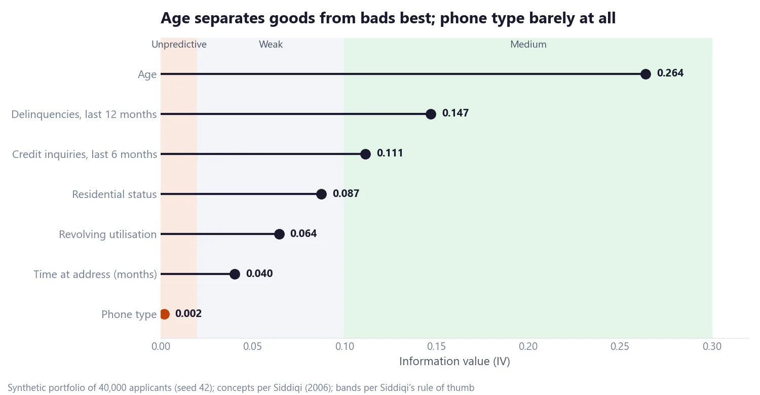
Siddiqi's rule of thumb (p. 81) reads:
| IV | Predictive strength |
|---|---|
| Below 0.02 | Unpredictive, not used |
| 0.02 to 0.1 | Weak |
| 0.1 to 0.3 | Medium |
| 0.3 and above | Strong |
Phone type, at 0.002, is dropped: it doesn't separate goods from bads, and it is easy to misstate on an application anyway.
What about IV above 0.5?
A common shortcut says an IV above 0.5 means the variable is leaking the outcome and must go. The book is more careful than that. Siddiqi writes that characteristics with an IV above 0.5 "should be checked for over-predicting—they can either be kept out of the modeling process, or used in a controlled manner" (p. 82). His own worked example of age in the same chapter has an IV of 0.668.
That matches what I see at the bureau where I work. In generic bureau scorecards predicting probability of default, variables built on days past due routinely score above 0.5. (In this simulated application portfolio, the delinquency variable is much weaker, at 0.147.) That isn't leakage when days-past-due variables are measured before the application date; in my experience, past repayment behaviour is the strongest predictor of future repayment there is. FICO, for example, weights payment history at 35% of its score, the largest of its five factor groups (as of October 2026, per myFICO). The check that matters is timing: make sure the variable could not have been influenced by the outcome you are predicting.
When a grouping is good enough
A grouping is accepted only when it makes business sense, not merely because its IV is high:
| Check | What to look for | Example from the simulated data |
|---|---|---|
| Logical trend | WOE moves in one direction as the characteristic's value increases, unless a reversal can be explained | Utilisation WOE falls steadily from +0.30 (below 10%) to −0.87 (90% and above) |
| Group size | Each group holds enough accounts, typically at least 5% of the sample | Age groups hold 7% to 30% of accounts |
| Distinct groups | Neighbouring groups have clearly different WOE; otherwise merge them | In the full sample, the six age groups step clearly apart: −0.769, −0.495, −0.239, +0.123, +0.634, +1.053 (smallest gap 0.26) |
| Missing as a group | Missing values get their own group when their risk differs | Missing time at address: −0.27 |
| Business fit | Legal to use, reliably captured, available in future, hard to manipulate | Phone type dropped: unpredictive and easy to misstate |
The 5% minimum is Siddiqi's rule of thumb too ("minimum 5% in each bucket", p. 80), and I agree with it. Smaller groups produce weights that swing from one sample to the next.
Logistic regression on WOE inputs
With every characteristic coded as WOE, a logistic regression combines them into one prediction:
ln( p / (1 − p) ) = β0 + β1·WOE1 + … + βk·WOEk

p = probability of being good, so the left side is the log of good:bad odds
Fitted on the development sample:
| Characteristic | Coefficient (β) | Standard error | Wald χ² | IV |
|---|---|---|---|---|
| Age | 1.056 | 0.043 | 606 | 0.264 |
| Residential status | 1.070 | 0.072 | 220 | 0.087 |
| Time at address | 1.094 | 0.102 | 114 | 0.040 |
| Delinquencies, last 12 months | 1.060 | 0.051 | 441 | 0.147 |
| Credit inquiries, last 6 months | 1.075 | 0.061 | 308 | 0.111 |
| Revolving utilisation | 1.102 | 0.078 | 197 | 0.064 |
What to read from it:
- The intercept, β0 = 2.194, is roughly the log of the average odds. e^2.194 ≈ 9.0, matching the sample's 25,187 goods to 2,813 bads: good:bad odds of about 9 to 1.
- Coefficients near 1 are good news. With WOE inputs, a coefficient of about 1 means the characteristic carries mostly its own information. Slightly above 1, as here, is normal when the inputs share little information; values well below 1 signal overlap with other characteristics.
- Every coefficient should be positive. A negative one would flip that characteristic's WOE trend, making safer groups score worse. It almost always means correlation with another input, and the fix is to drop or regroup one of them.
- The Wald chi-square tests whether each coefficient is different from zero. All six are far above any usual threshold.
Part 5 shows how these coefficients and WOE values become points, which is where the 124 points for a 55-year-old in the opening come from.
Building the model in blocks
Rather than letting a stepwise search pick characteristics, the build here adds them in blocks that mirror a credit officer's view of an applicant:
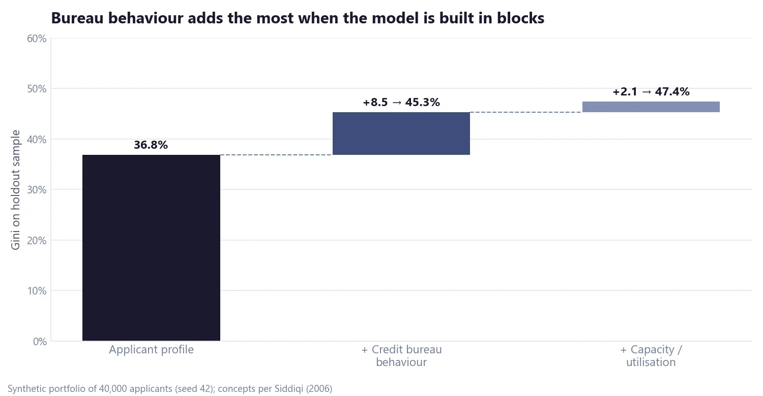
- Applicant profile: age, residential status, time at address. Gini 36.8%.
- + Credit bureau behaviour: delinquencies and credit inquiries. Gini 45.3%, the biggest step.
- + Capacity: revolving utilisation. Gini 47.4%.
Gini measures how well the score ranks good and bad borrowers on a holdout sample, from 0% (random) to 100% (perfect); Part 5 covers it in detail. These figures come from the unrounded model, so they can differ by 0.1 point from the final points-based scorecard.
The block-by-block build shows what each type of information adds, and it can keep weaker but stable characteristics that a purely automated forward, backward or stepwise search might drop. Those automated methods remain valid alternatives, but the staged build is easier to explain to the people who will use the scorecard.
Next, Part 4 tackles a problem hiding in every development sample built from approved applicants: reject inference.
Over to you
Binning is where a scorecard developer's judgement shows most, and it is also where practices differ most between teams. Do you still group characteristics by hand, rely on automated binning, or use a mix of both? And where do you draw the line on information value? I would like to hear how your team handles it: get in touch.
Hafizh Yuwan Fauzan (Hafizh Fauzan) is a credit risk data scientist in Jakarta, Indonesia, building scorecards and machine learning models on national-scale credit data.