Defining 'Bad' in Credit Scoring: Samples, Windows, Roll Rates and Segments
By Hafizh Yuwan Fauzan · 2026-09-30
Part 2 of 7 in a series on building credit risk scorecards. Part 1 covered how a scorecard turns points into odds.
Every scorecard predicts the chance that an applicant goes "bad". What surprises people outside credit risk is that there is no single definition of bad. Each lending institution sets its own, and in Indonesia I see how much they differ, because risk appetite differs even between lenders offering the same type of loan. Within one conventional bank, the definition used for a buy now, pay later product will not be the one used for its mortgages.
That makes the bad definition one of the most important decisions in the whole build. The model can only learn the outcome you give it. This part covers how that outcome is set: who belongs in the sample, how long each account is watched, where "bad" starts, when to split the population into segments, and how big the sample needs to be.
Key takeaways
- Exclude only applicants who will never be scored in production, and record every exclusion.
- Follow every account for the same performance window; vintage curves show how long it needs to be.
- Roll rates show where accounts stop recovering. That status is where "bad" should start.
- Accounts that are neither clearly good nor clearly bad are left out of the model build.
- Segment only when groups behave differently enough to repay the cost of another scorecard.
About the numbers. Every number here is synthetic, built for my refresher on N. Siddiqi's Credit Risk Scorecards (Wiley, 2006), the book this series follows.
The segmentation figures come from a simulated portfolio of 40,000 applicants, including those a past policy would have declined, which is why its bad rates run higher than the approved-account curves. The roll rates come from a different simulation: 20,000 accounts followed month by month for 24 months, because roll rates need each account's monthly payment status, which the applicant portfolio doesn't record. The vintage curves are a third, illustrative simulation, and the oversampling example uses round illustrative numbers. So the figures explain each concept on their own; they are not meant to add up to one book.
Who belongs in the sample
The development sample should look like the applicants the scorecard will actually score. So the first step is removing the ones it never will:
| Excluded group | Why it is removed |
|---|---|
| Fraud and identity-theft cases | Their performance reflects the fraud, not credit risk |
| Staff, VIP and test accounts | Approved outside normal rules |
| Policy declines (e.g. under legal age, bankrupt) | Declined before any score is used |
| Other products or segments | Scored by a different scorecard |
| Cancelled or deceased | No meaningful payment performance |
Three rules keep exclusions honest:
- Remove only cases that won't be scored under normal operating conditions. Anything else shrinks the sample and biases it.
- Record the count behind every exclusion. Someone will ask you to reproduce the sample, and a validator will ask why it shrank.
- Keep unusual but scored applicants. They are part of the population the model has to rank, even when they are awkward to model.
Two windows: when applicants are sampled, and how long they are watched
Every account in the sample needs a fair, equal chance to show whether it goes bad. That is done with two windows.
Take an illustrative build with an observation date of December 2024. The sample window is the period applications are collected from, here all of 2022. Twelve months averages out seasonal swings, such as a spike in applications before a holiday season.
The performance window is how long each account is followed after its application date, here 24 months. The point is that every account gets the same window: an account opened in March 2022 is judged on March 2022 to March 2024, and one opened in December 2022 on December 2022 to December 2024.
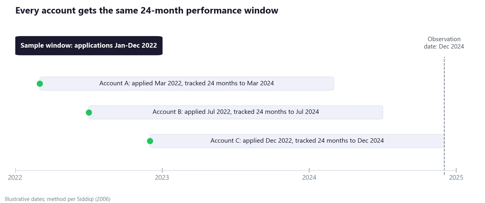
There is a trade-off built in. A longer performance window catches more of the accounts that will eventually go bad, but it pushes the sample further into the past, so the model learns from applicants who may no longer look like today's. The next section shows how to choose.
How long to watch: reading vintage curves
A vintage curve follows one cohort of new accounts, for example everyone approved in the first quarter of 2023, and plots its cumulative bad rate as the accounts age. The curves below use a working definition of bad, ever 90+ days past due, which the roll rates in the next section confirm. Plot several cohorts together and you can see how long it takes for bads to stop appearing.
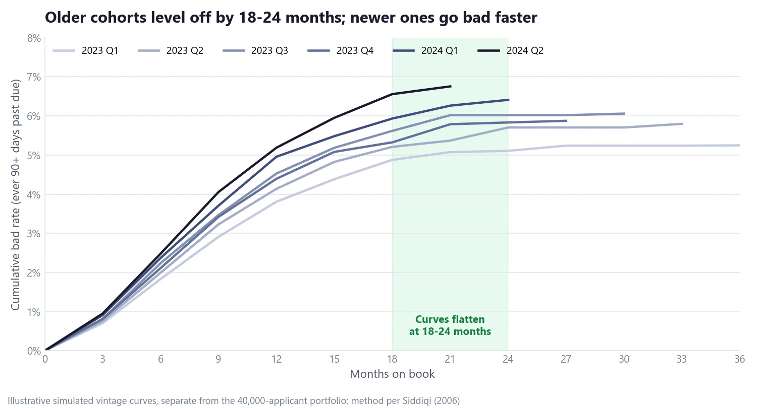
Two things stand out in this simulation:
- The curves rise steeply in the first year and are close to flat by month 18 to 24. A 24-month performance window therefore captures nearly all the bads. A 12-month window would miss roughly a quarter of them: the 2023 Q1 cohort is at 3.8% after 12 months and ends at 5.25%.
- Newer cohorts sit higher at the same age. At 12 months, the 2024 Q2 cohort is at 5.2% against 3.8% for 2023 Q1. That is a warning sign that credit quality is drifting, worth raising before any model is built on the older cohorts.
Where "bad" starts: roll rates
With the window fixed, the question is which status makes an account bad. Roll-rate analysis answers it by comparing each account's worst status in the previous 12 months with its worst status in the next 12.
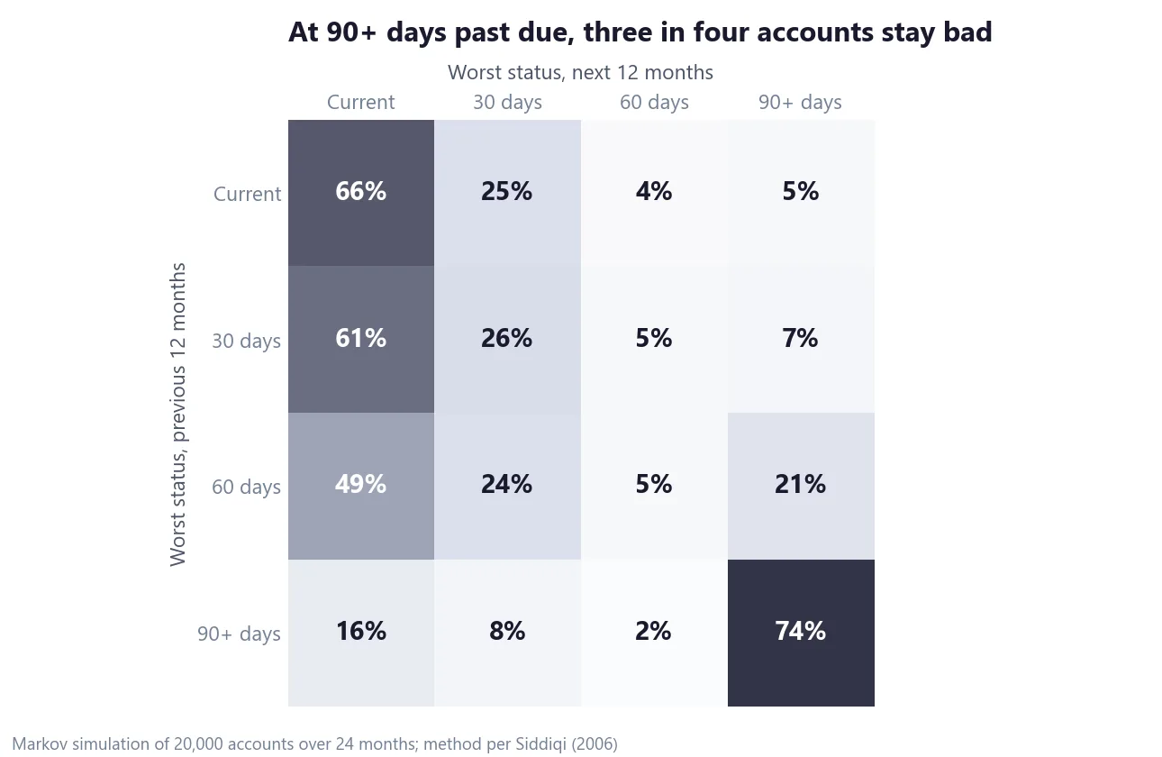
Read each row as "of the accounts that were at this status, where did they end up?" (rows may not add to exactly 100% because of rounding):
- 30 days past due mostly cures. 61% of those accounts are current again in the next year.
- 60 days is mixed. 21% roll on to 90+ days, while 49% cure.
- 90+ days rarely recovers. 74% reach 90+ again in the next year, and only 16% fully cure.
The bad definition should sit at the status from which accounts rarely recover, so in this simulated data that is ever 90+ days past due within the performance window. A lender with a different product or risk appetite may land somewhere else, which is exactly the point from the introduction: the same analysis, run on a buy now, pay later book and a mortgage book, can give different answers.
The definition should also be checked against two other things. One is the lender's charge-off policy, the point at which it writes a debt off as a loss. The other is the regulatory definition of default: under the Basel framework, a borrower is in default when, among other triggers, they are more than 90 days past due on a material obligation, and supervisors may allow up to 180 days for some retail products. A scorecard that predicts one outcome while the credit policy and the regulator use another creates reconciliation work every time the model is reviewed.
Good, bad and indeterminate
Not every account fits neatly on one side. Accounts are labelled into three classes:
| Class | Example definition | Treatment in development |
|---|---|---|
| Bad | Ever 90+ days past due, charged off or bankrupt within the performance window | Modelled as the bad outcome |
| Indeterminate | Worst status 30–89 days past due, or inactive and too new to judge | Excluded from the model; kept when forecasting approval rates |
| Good | Never worse than 29 days past due and active during the window | Modelled as the good outcome |
Leaving the indeterminates out keeps the two classes the model learns from clearly distinct. Report their share, though. If a large part of the book is indeterminate, the good/bad split rests on a thin slice of it.
One scorecard or several: segmentation
Sometimes one scorecard is not enough, because different groups of applicants carry different information. A thin-file applicant with under two years of credit history has little bureau data to score, so the predictors that work for established borrowers work less well for them.
Segments come from two places. Experience-based segments use business knowledge and data availability: thin versus thick credit file, product, channel, new versus existing customer. Statistical segments come from decision trees or clustering on the development data, looking for groups where the relationship between predictors and risk differs.
The test is whether a separate scorecard actually ranks risk better on data it has not seen. Here that is measured with the Gini coefficient on a holdout sample, a slice of data kept out of model building; for now, read Gini as "how well the score separates good from bad borrowers, from 0% (no better than random) to 100% (perfect)". Part 5 covers it properly.
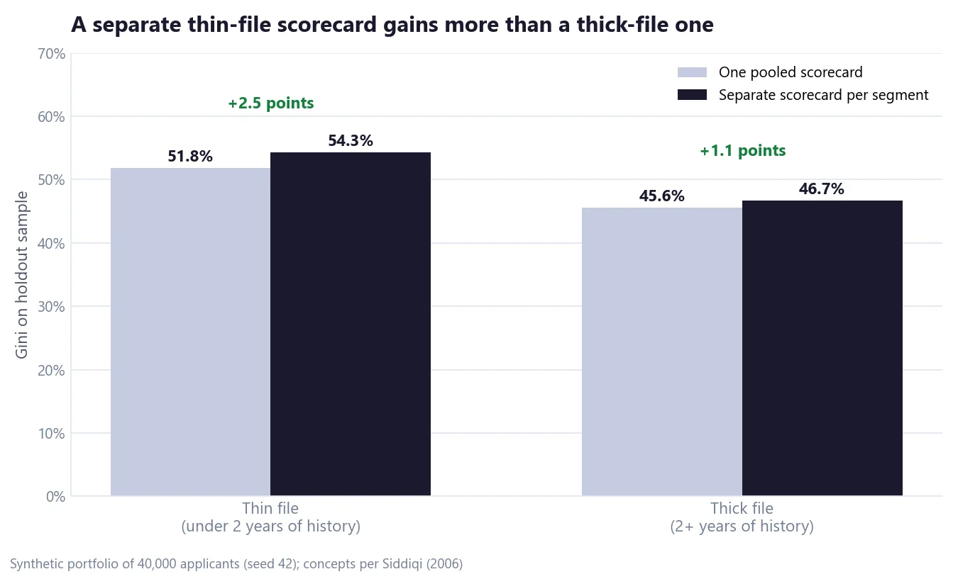
- Thin file: 30% of applicants with a 17.3% bad rate. A separate scorecard lifts Gini by 2.5 points, enough to justify the cost of a separate model.
- Thick file: 70% of applicants with a 7.0% bad rate. The lift is about 1 point, which may not repay a second model.
That last point matters. Every extra scorecard adds build, implementation and monitoring cost, and each segment needs enough bads of its own to support a separate model. A gain of one or two Gini points on a single holdout should also be checked for stability, for example on a later out-of-time sample, before you commit to it.
Building the development sample: size, characteristics and oversampling
The rule of thumb in Siddiqi's book is about 1,500 to 2,000 accounts of each kind:
| Sample component | Rule of thumb |
|---|---|
| Goods | About 1,500–2,000 accounts |
| Bads | About 1,500–2,000 accounts; the scarce class sets the sample size |
| Rejects | About 1,500–2,000 declined applicants, for reject inference (Part 4) |
| Development vs holdout | Random 70/30 or 80/20 split |
Which characteristics to collect
When choosing which characteristics to collect, favour ones that are predictive, hard for applicants or staff to manipulate, available at the time of future applications, explainable to the business, and legal to use. A characteristic that fails any of those is a problem later, however well it predicts.
Fixing the odds after oversampling
Bads are scarce, so a development sample often includes far more of them than the real population does. Here, half the sample is bad against a 4% bad rate in the population. That distorts the model's intercept, the baseline level of risk it starts from, and so every probability it produces, unless it is corrected. There are two standard fixes.
The oversampling offset. Add a constant to the model's log-odds of being good, where ρ is each class's share in the sample and π its share in the population. If your model predicts the log-odds of being bad instead, subtract it.
adjusted log-odds of good = model log-odds of good + ln( (ρ_bad × π_good) / (ρ_good × π_bad) )

offset = ln( (0.5 × 0.96) / (0.5 × 0.04) ) = ln(24) = 3.178
A sample-based prediction of 50% good becomes 96% good (4% bad) after the offset, and 20% good becomes 85.7% good. The offset moves only the intercept, so the ranking of applicants does not change.
Sampling weights. Weight each class by population count divided by sample count. With 100,000 applicants at a 4% bad rate, and 2,000 goods and 2,000 bads sampled, each good carries a weight of 48 (96,000 ÷ 2,000) and each bad a weight of 2 (4,000 ÷ 2,000). The weighted bad rate is back to 4%. Unlike the oversampling offset, a weighted fit can shift the model's slopes slightly, but weights have a practical advantage: gains tables (the score-band summaries covered in Part 6) and approval forecasts built on the sample then reflect the real population.
The takeaway
The bad definition is a business decision backed by analysis, not a statistical default. Vintage curves tell you how long to watch, roll rates tell you where recovery stops, and the lender's own products and risk appetite shape the answer, which is why two lenders, or two products at the same lender, rarely end up with the same one.
If you missed it, Part 1 explains how a scorecard turns points into odds. Part 3 turns this sample into a model: weight of evidence, information value and logistic regression.
If your institution defines bad differently across products, I would like to hear how you arrived at it: get in touch.
Hafizh Yuwan Fauzan (Hafizh Fauzan) is a credit risk data scientist in Jakarta, Indonesia, building scorecards and machine learning models on national-scale credit data.