From Model to Scorecard: Scaling Points, KS, Gini and Validation
By Hafizh Yuwan Fauzan · 2026-10-03
Part 5 of 7 in a series on building credit risk scorecards. Part 4 showed why approved-only data understates risk.
In Part 1, on how a scorecard works, our worked applicant earned 84 points for being aged 30–34; on the same scorecard, an applicant aged 55 or over gets 124. In Part 3, on WOE and logistic regression, the 55+ group had a weight of evidence of 1.053 and the age characteristic a coefficient of 1.056. One formula connects those numbers, and this part starts with it.
The second half asks the question every validator, committee and client will ask: is the scorecard any good? That means a confusion matrix, the KS statistic, the ROC curve and Gini, divergence, and the out-of-time tests that show whether the model will hold up after go-live.
As before, all numbers come from the simulated 40,000-applicant portfolio behind my refresher on N. Siddiqi's Credit Risk Scorecards (Wiley, 2006): a 28,000-account development sample and a 12,000-account holdout.
From log-odds to points
The regression from Part 3 predicts the log of the good:bad odds. Scaling turns that into a score using three choices, all set in Part 1: a reference score (600), its odds (50 to 1), and the points needed to double the odds (20, called PDO).
Score  = Offset + Factor × ln(odds)
Factor = PDO / ln 2              = 20 / 0.6931       = 28.8539
Offset = 600 − Factor × ln(50)   = 600 − 28.8539 × 3.91202 = 487.1229
A quick check: odds of 100 to 1 give 487.12 + 28.854 × ln(100) = 620 points, and odds of 12.5 to 1 give 560. Each 20 points doubles the odds, exactly as designed. (This scaling Offset is unrelated to the oversampling offset in Part 2.)
Points for each attribute
A scorecard needs points per attribute, not one score per applicant. Each attribute's points come from its weight of evidence (WOE) and its characteristic's coefficient (β), plus an equal share of the intercept (β0) and the offset, where n is the number of characteristics in the model (six here):
Points = ( β × WOE + β0 / n ) × Factor + Offset / n
For age 55+:
( 1.0559 × 1.0535 + 2.1938 / 6 ) × 28.8539 + 487.1229 / 6
= ( 1.1124 + 0.3656 ) × 28.8539 + 81.1871
= 123.8, rounded to 124 points
That is the 124 points a 55+ applicant gets in the finished scorecard below. Spreading the intercept and offset evenly gives every characteristic the same base, so points stay positive and readable; attributes differ only through β × WOE × Factor. Rounding to whole points moves any total score by at most 3 points (six characteristics × 0.5), small next to the 20 points that double the odds.
The finished scorecard
| Characteristic | Attributes and points |
|---|---|
| Age | 18–24: 68 · 25–29: 77 · 30–34: 84 · 35–44: 95 · 45–54: 111 · 55+: 124 |
| Time at address (months) | Missing: 83 · 0–11: 83 · 12–23: 88 · 24–59: 94 · 60–119: 98 · 120+: 101 |
| Revolving utilisation | <10%: 101 · 10–29%: 99 · 30–49%: 94 · 50–69%: 87 · 70–89%: 76 · 90%+: 64 |
| Delinquencies, last 12 months | 0: 99 · 1: 78 · 2+: 58 |
| Credit inquiries, last 6 months | 0: 105 · 1–2: 90 · 3+: 71 |
| Residential status | Own: 104 · Rent: 86 · With parents: 82 · Other: 85 |
Total scores run from 426 to 634 points. Age and delinquencies create the widest point ranges, which matches their information values from Part 3.
Is it any good? Start with one cutoff
The most intuitive check is to pick a cutoff and count what it gets right and wrong. At an illustrative cutoff of 540 on the holdout sample:
| Actual outcome | Approved (score ≥ 540) | Declined (score < 540) |
|---|---|---|
| Good | 8,754 correct approvals | 2,010 goods declined (lost business) |
| Bad | 613 bads approved (credit losses) | 623 correct declines |
So the scorecard declines 50.4% of the bads (623 of 1,236) at the price of declining 18.7% of the goods (2,010 of 10,764), and misclassifies 21.9% of all applicants. The two errors have very different costs: a lost good customer costs profit, an approved bad one costs principal. That is why candidate scorecards should be compared at the cutoff the business will actually use; Part 6 covers choosing that cutoff.
KS: the widest gap
The Kolmogorov–Smirnov statistic looks at the whole score range at once. Plot the cumulative share of bads and of goods at or below each score; because bads score lower, their curve rises first. KS is the widest vertical gap between the two.
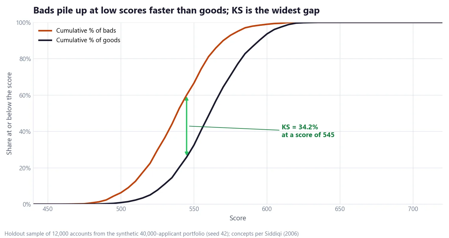
Here KS is 34.2%, reached at a score of 545: a cutoff at 545 would decline 34 percentage points more of the bads than of the goods. Two cautions. KS is read at a single point, so two scorecards with the same KS can rank quite differently elsewhere. And where the maximum sits matters; separation near the planned cutoff is worth more than separation at the extremes.
Gini: how well the scorecard separates good from bad
The ROC curve summarises ranking across every possible cutoff. It plots the share of bads declined against the share of goods declined as the cutoff moves up the score range.
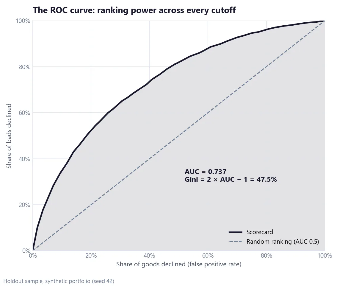
The area under the curve (AUC) is the probability that a randomly chosen good outscores a randomly chosen bad: 0.5 for a model with no power, 1.0 for a perfect one. Gini rescales it:
Gini = 2 × AUC − 1 = 2 × 0.7373 − 1 = 47.5%
When someone outside credit risk asks me what Gini means, I say it is how good the scorecard is at differentiating between good and bad customers. The Basel Committee's research on validating rating systems frames it the same way, treating measures like Gini (also called the accuracy ratio) and AUC as measures of a rating system's discriminatory power (BCBS Working Paper 14, 2005).
What counts as a good Gini?
There is no single target, and this is where I spend a lot of time managing expectations with stakeholders and clients. In my experience, two things move the number more than anything the modeller does:
- The type of scorecard. A behaviour scorecard, scoring existing accounts, will usually show a clearly higher Gini or KS than an application scorecard. It has the account's own repayment history to work with, in my experience the strongest predictor there is. It also needs no reject inference, because every account in its sample was approved and observed (Siddiqi, pp. 73 and 98).
- The performance definition. A scorecard predicting default on one contract is a different target from one predicting whether the customer defaults on anything, and the same model will measure differently against each. Supervisors recognise both levels: the ECB's guide to internal models discusses default defined "at the level of an individual credit facility" as well as at obligor (customer) level (ECB guide to internal models, July 2025 edition; the ECB has since issued an update).
So before anyone compares a Gini of 47.5% with a figure from another project, check that both were measured on the same kind of scorecard, the same performance definition, and the same type of sample.
Divergence: how far apart the two groups sit
Divergence compares the average score of goods and bads relative to their spread:
Divergence = ( μ_good − μ_bad )² / ( ½ × ( σ_good² + σ_bad² ) )

Goods average 561.5 points and bads 539.1. With the spread of each, divergence is 0.80 on the holdout and 0.78 on the development sample. A larger value means cleaner separation; the measure assumes roughly normal distributions, so read it alongside KS and Gini rather than on its own.
Validation: will it hold up?
Every statistic so far could be flattering if the model had simply memorised its development sample. Validation repeats them on data the model never saw.
| Measure | Development | Holdout | Difference (pp = percentage points) |
|---|---|---|---|
| Accounts | 28,000 | 12,000 | n/a |
| Bad rate | 10.0% | 10.3% | +0.3 pp |
| KS | 34.14% | 34.17% | +0.03 pp |
| Gini | 46.68% | 47.46% | +0.8 pp |
| AUC | 0.733 | 0.737 | +0.004 |
| Divergence | 0.78 | 0.80 | +0.02 |
Every difference is under one percentage point (and 0.004 in AUC), so there is no sign of overfitting. A clear drop from development to holdout would point to, for example, too many groups or too many characteristics. Compare bad rates band by band too, not only the summary statistics.
Out-of-time is a must
A random holdout comes from the same period as the development data, so it can't tell you whether the model survives a change in the population. In my work an out-of-time (OOT) sample, from a later period, is a must. Supervisors expect the same: the ECB guide (July 2025 edition) says independent test data should cover "not only random sampling (out-of-sample), but also … different time periods (out-of-time) unless there are no sufficient data available".
At the bureau where I work, we also run what we call an ultra OOT: a check on the most recent applicants, so recent that their performance is not known yet. With no outcomes to measure, the check is on stability instead: whether today's applicants score and look like the development sample, characteristic by characteristic. Siddiqi describes a closely related step, pre-implementation validation, comparing applicants from the last three and six months with the development sample using the population stability index and characteristic analysis (pp. 135–137 and 163). Part 7 covers those stability measures in detail.
Formula card
Everything in this part, in one place:
Factor      = PDO / ln 2
Offset      = Score_ref − Factor × ln(odds_ref)
Score       = Offset + Factor × ln(odds)
Points      = ( β × WOE + β0 / n ) × Factor + Offset / n
KS          = max over scores of | cum % bads − cum % goods |
Gini        = 2 × AUC − 1
Divergence  = ( μ_good − μ_bad )² / ( ½ × ( σ_good² + σ_bad² ) )
Earlier parts: how a scorecard works, defining "bad", WOE, IV and logistic regression and reject inference. Part 6 puts the scorecard to work: gains tables, cutoffs, break-even odds and overrides.
If you have a rule of thumb for what Gini to expect from different kinds of scorecards, I would like to hear it: get in touch.
Hafizh Yuwan Fauzan (Hafizh Fauzan) is a credit risk data scientist in Jakarta, Indonesia, building scorecards and machine learning models on national-scale credit data.